Sunday 23 February 2014

Locating unit evaluation

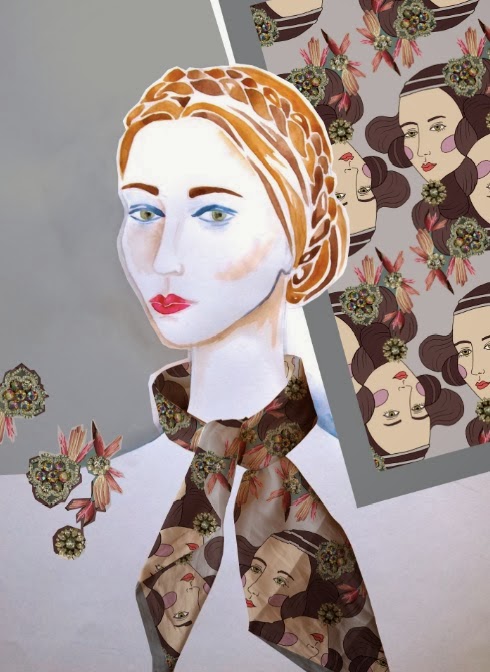
I thoroughly enjoyed the Locating unit and I think in general my work has greatly improved since the Intentions unit. It was during the last unit that I finally mastered Photoshop, but during this project I have developed on those skills and feel I can now define myself as a digitally-based designer. In this unit I have tried to focus on where I see myself in the design world, which is why I chose to do a project for fashion. Although I was designing my prints for Hermes, I also tried to treat the project as if I was a freelance designer, hence why I felt it was important to manufacture an example product and to consider its presentation, to prove (if only to myself) that I was capable of producing a professional looking item. 

I feel in this project there was a strong theme that continued throughout - dressing up and historical costume was always the underlying theme, but exotic birds was the recurrent motif and inspiration. Now that I am very much at ease with Photoshop, I enjoyed pushing my skills of digital collage by combining photography and illustration. All the way through, context has been extremely important, as it has influenced every part of the designing process. I think having a clear vision of the end market, and also colour theme, helped me to create a coherent final collection. 

While my personal project was very self indulgent, I benefitted from the challenge of the two live projects. For the Tigerprint brief I created butterfly based designs for a female audience, making sure to create prints that would be suitable for Marks and Spencers. In the Patternmash brief I absorbed all the inspiring images for the 'Midwinter' theme to create scandinavian inspired illustrations which were featured on the blog. I really enjoyed discussing my work with Hannah, the ex-Manchester student who runs the web site,  and I am going continue to submit work to every monthly theme, hopefully building publicity for my work. Doing the live briefs has taught me about working to a short deadline and also the importance of taking on work outside my university projects, and I look forward to creating my prints for the Art House Co-op Print Exchange. 

All in all, I have tried to create a slick and professional body of work and focus on the future of my practice. I am looking forward to participating in Unit X and working on the ideas I have developed in this project. 

Final presentation

As I had done a digital project, it seemed apt to do my final presentations digitally too. I displayed each of my 10 final prints as above, and I like the way it lets you see a close up of the detail in the design. As the original designs are rather bright, I created cool and grey colour ways to give the customer choice to pick a design that suits their own wardrobe. In the corner is a visualisation to show how the scarf would look knotted - I felt simplicity was best in this case. 

Below is one of my final illustrations, to show the final product. I wanted a little more variety in my visualisations, so I created the headscarf image to show a different way of wearing it (Liberty's demonstrate many ways to wear their scarves in online videos and illustrated cards). I like the effect of displaying two scarves in one image as it shows different sides of the collection - the two below are the two designs I chose to digitally print. 


Saturday 22 February 2014

Final designs


Here is my final collection of ten scarf designs. I tried to choose a diverse range that contain a variety of motifs and themes (from art deco interiors and regency striped wallpaper, to faces and abstract bird prints) but the colour theme is what brings it all together - a muted colour palette dominated by soft khaki green, pinks, greys and blues, with bright shots of yellow, hot pink and royal blue to draw in the eye. I'm so pleased with the overall look of the collection: each print works on its own and as a part of the group. To name the collection I decided to go back through my research to pick something that summed up the original brief, and finally chose to call it 'Frippery and Frills' - a name that suggests the frivolous nature of dressing up, but also encounters the idea of historical costume with the use of slightly old fashioned vocabulary. 

Thursday 20 February 2014

Changes to brief

As the project has developed, there has been some things that I have been very adamant about, but others that have adapted and changed depending on the nature of my work. I have therefore needed to  tweak my brief slightly - in the beginning I was set on doing styled photographs, and whilst this was in the back of my mind during the project, I ended up being much more focused on developing my designs that it wasn't something that seemed as important to the project anymore. This thought was reinforced when I did my visualisations using illustration, as I felt this fitted in much better with the course of the project, and visually summed up my project better than perhaps photographs would have. In this case I don't think styled photographs were necessary, but it is something I would like to go into in the future. 

Presentation box


Hermes are well known for their orange presentation boxes, and after much research and deliberation I have come to the decision that I should do something slightly different for my project. As I have chosen to print two scarves to display different elements of my collection, I have chosen to make a slightly longer box that will house both scarves, rather than the expected square. I also wanted to stray away from the simple box cover - Hermes are a traditional business that have a long history, whereas I want to reflect the fact that my designs are quirky and new, so I have designed a cover that fits that. I think the use of the layered feathers sums up the collection and the extravagant element of my brief rather well, whilst the minimal writing lets the visuals do the talking. I realise that if I was making these scarves to sell, I would also wrap the scarves in tissue, and have cards explaining the collection and a bio about myself as a designer.


Tuesday 18 February 2014

Last tutorial

The last tutorial mainly consisted of discussing everyones final designs and working out what has to be handed in for the deadline. As my prints have all been designed full size (90cm x 90cm) I was unsure how to present my designs, and Alex suggested in my case that I do them professionally (as we were shown in one of the early workshops), with a section of the print to scale, an image of the entire print, colour ways and a visualisation. I'm actually really looking forward to doing the presentation bit as I think it will work very well with my work. Even though I know it isn't necessary to print my scarves, I really want to actually make something and this is the perfect project to do it on - although I am aware that to meet my high-end market I will have to finish them appropriately (hand rolled hems) and design a box to put them in.

Whilst I was explaining my final print designs, it was suggested that my work may separate into two collections - I will see as the week goes on, but I don't think I have enough strong prints to create two entire collections, plus I think they will all work within one. 

Sunday 16 February 2014

Live project evaluation

I found doing the live projects a very positive experience overall, and the fact that both the briefs were so different from my personal project, and even from each other, meant I had the chance to try something different and challenge the way I design. 

I viewed the Tigerprint brief like a job, it definitely wasn't very 'me' and I thought the suggested female icons sounded very twee - make up, shoes and handbags - but I suppose it is for a commercial company so you have to create designs that appeal to many people, entire genders even! I tried to create something that would fit in with the house style, and was actually rather impressed with what I created - very removed from what I usually do, but a great challenge that proved to myself that I can do these sort of briefs. 

The Patternmash brief on the other hand was right up my street and I was very inspired by the theme. I had plenty of ideas, but it was interesting to see how this one took slightly longer to do, perhaps because I really cared about the overall outcome and how it looked. It was a great experience being in direct contact with Hannah and actually having a conversation with her about the project and my work. I got a really great response from her about my designs (particularly about how I responded to specific images from the Pinterest page) and my work ended up on the Patternmash blog.

http://www.patternmash.co.uk/post/75995140566/lucy-smith-is-a-textiles-in-practice-student-at

I also think it was a good idea only giving myself a few days to complete both briefs, treating it like a mini project, as it gave me practice of working to a short dealine - it is so easy to get totally absorbed in your work when you are spending many weeks on it. 

Digital samples

As I really want to get at least one of my scarves digitally printed, I decided it would be a good idea to print off some samples, to see the quality of line on the fabric and to test the colours. I chose two prints in very opposite colour ways - a really vivid one to test the bright colours, and a subdued one to test the paler colours. I printed off A4 sized samples on the habotai silk as this was the fabric that would look closest to the quality of a Hermes scarf, and they came out really nicely - very good quality line that wasn't at all blurry. Digital printing is perfect for my designs this project as I have used a lot of photographic elements, and it allows to have a much higher range of colours than could be achieved on screen. 


Photoshop displace

I was thinking of ways I could illustrate my work and thought of the idea of displacing my prints onto a fabric scarf and then placing it onto an illustration of a head, to make it tie in better with my project but to also utilise the displace skills we learnt in the workshop. I based my illustration on those renaissance style photo shoots to help tie everything together.  I was so pleased with how well it turned out as the illustrative face really makes it tie in with my project, and is just a slightly different approach to visualisations. As the scarf looks so different when draped, I decided to display a section of the print next to the drawing to give the viewer an overall view of the final product. Placing my work into visualisations has also really helped how I design the scarves, as it has confirmed the importance of filling the corners, and is an easy way to see which designs work well - it is all well and good my designs looking nice flat, but they also have to work well when worn. 


Thursday 13 February 2014

Final designs

And so my final designs have been coming on a pace: I've tried to play around with each motif in as many ways as possible to get the best effect and produce as many designs as possible to give me plenty to choose from. Below are some of my earlier designs which were good for practice work, but perhaps don't make best use of the square shape. I tried playing around with layered brushes (left) but I think the resulting image is too flat - I'm not trying to replicate screen print, I want to make the most of the digital medium. Also I feel the textured feather hair is totally lost here. I also think having a totally flat background is a bit boring (right) and I think in general, having a combination of photography and drawing, as I have experimented with all project, would generally look stronger.


So I went back to my context research and thought more about my design layout, realising that the edges are actually the most important part of the scarf as this is actually what you see when it is worn. Here I tried to use more photographic elements and I think this has a much more eye catching visual effect. The feedback I got from everyone was that they really liked the bird neckline (left scarf) so I decided to use this as its own motif and I think it looks rather striking and over-the-top (and therefore encapsulating the theme).


Tuesday 11 February 2014

Tutorial

Today was mainly beginning to realise our plans for the project, discussing how we are going to get everything done in time, and also presentation boards. I'm quite glad about this (the boards) as we don't always have to do them; I rather like the idea of looking at my work retrospectively and summing up the progression of my project in a limited space. As we have to do 2 - 3 boards to show the progression of the project, the general consensus is to have one board for research and one for development. I think I may do one research for generally throughout the project, and then one for context research, as all the way through the end product has been very important for me - at every stage of the process I have considered how I should design appropriately for the product and how I should design for my market - so I think I ought to document this. 

Sunday 9 February 2014

CV lecture

I think this was really useful, as I have been building the beginnings of a CV lately, but I wasn't sure exactly what specific information to include, how lengthy, how it should be presented etc. I think I now have a better grasp of what a creative CV should look like and have started to brainstorm ideas of how to make my CV stand out from the crowd, visually as well as content wise. In the meantime I have also been looking for extra projects that will help build up my experience, and I have signed up to the Art House Co-op's 'Print Exchange', where 500 artists across the world submit an edition of hand-produced prints that will be exhibited in New York later on in the year. I have taken part in their 'Sketchbook Project' before which was rather fun, and I think it will be a good way to display my hand printing skills as most of my work is now digitally based. 

Photoshoot inspo

Whilst I was home for the weekend I found a great renaissance style editorial shoot in a magazine, and it perfectly reflected the style I have been trying to get across in my figures for the entire project - all plaits and wistful faces in traditional poses. It was annoying to find it this late on in the project as I feel my drawings would have had such a better theme and been more coherent if I had been influenced by this since the start. It has set me off at looking at other photographers however, and I am thinking of taking it as inspiration for my photoshoot for the end of the project. 

In particular was this shot for Harper's Bazaar Vietnam, by photographer Zhang Jingna. I love the simplicity, the use of dark space in the composition and the focus on the plaited hair. I definitely want to reflect this sort of style in my own photos. 


I also liked these more opulent backdrops in these fashion images by Nikolay Biryukov, although I don't know whether I want my photos to be quite so grand, I think I still want the main focus to be on the scarf, and I wouldn't want the print getting lost in such a complex image.

Wednesday 5 February 2014

Colour mood board

So here is the board I mentioned in the last post. I tried to get across the mixture of warm, bright and softer light colours that had inspired me so much in the vintage bird pictures at the beginning of the project. I also included a few artists whose work had a similar sort of colour vibe, along side photos I have taken myself throughout the project. 

In the top left is the two images that inspired my original colour stripes - one with the brighter vintage-y shades, and the other slightly more subdued and pale, with lots of blue and grey - and below is the revised colour stripe. In the bottom righthand corner is a great Estonian Soviet postcard I found that I thought summed up my colours rather well - pink, green and blue with the pop of red. I really liked Olaf Hajek's illustration with the bright colours of the flowers offset by the pale grey face, whilst Maurizio Bongiovanni's smudged bird painting had a great combination of deep rich colours, with the paler pinks and greens. I hope that by referring to this board whilst doing my designs, I will keep a coherent colour mood through the final collection.

Tuesday 4 February 2014

Tutorial

Today we discussed various bits and bobs that I need to get done in the next few weeks - one of those tutorials where I know what I need to get done, its just a matter of getting on with it. Talking about how the project has been going so far, it was suggested I put together a colour mood board as I am doing digital designs - there is such a wide spectrum of shades in each photo that it is hard to tie down the collection to just one specific colour swatch. I do want to try and whittle down my colour swatches tho, as I have mainly just been using the two separate ones at the same time, and there is a lot of cross over in colours, which just tends to make things confusing. 

Sunday 2 February 2014

Patternmash live project

This months theme for the Patternmash project was 'Midwinter' but what I liked the most was the scandinavian side of the brief - definitely a project that I found inspiring, and therefore I was really excited to work on it (rather than the Tiger one which I just treated like a job). I selected the 'Alpine Expedition' part of the brief, and put together this moodboard from different images she sent us. I feel so pleased with the final designs as I think they really reflect the theme well.