Thursday 7 August 2014

Degree show review - part 3

Claire Florey-Hitchcox


Although in my own work I tend to stick to digital print, I fell in love with Claire's woodblocks when I saw them in the degree show. I was astounded by the incredible amount of detail that was obtainable on  a surface as unforgiving as wood. I like to include multiple motifs in a design, so I was really interested to see how she had interwoven hundreds of objects to create one flowing pattern. I really liked how when you first look you just see overall pattern and then it is only when you look closer that you see all the objects. I really enjoyed her use of placement, as the combination of simple spots and stripes was a perfect way of framing the busy content. The reduced colour palette also helps to balance out the busy pattern. I think this could influence the way I use colour and motif placement in my own work, as I think flattening the imagery would be really effective way of varying my print designs. 

http://clairefloreyhitchcox.wix.com

Degree show review - part 2

Hollie Louise Davies


Hollie's work most definitely stood out to me as interesting and different to your average fashion print. Whereas Bethaney's prints were obviously pretty by nature (due to the use of florals) Hollie's prints seemed feminine yet bold and modern, with a real high end feel about them. I adore her use of colour, the orange, yellow and aquamarine shade of blue really stand out and draw the eye towards them, and has really inspired me to be more brave with my choice of colour in the future. I really liked the mix of prints in the collection, and it showed me how really simple prints can looked really interesting when mixed in with the more intricately detailed prints. Yet again the styling, photography and use of displacement on photoshop was especially inspiring, but what I loved the most was how Hollie had clearly really thought about the garments and how texture (such as pleats) would work with different prints. My own work is often very heavily based on motifs, whereas Hollie's interesting use of paint marks and watercolour/ink has inspired me to think more abstractly about my designs. 

http://www.hollielouisedavies.com

Degree show review - part 1

Bethaney Lauren Barrie


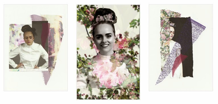
I really liked Bethaney's work, as you really can't beat a good floral. I loved everything about her prints, especially the way she made florals look so modern - the use of scale, bright and vivid colours and texture was spot on for me. I love the overall look of her lookbook, as the pared back and simplistic photography really shows off her prints; and the fact that the photography is her own shows that she has many talents outside of being a print designer. I thought her use of displacement was really skilled, as it really looks like the fabric has been printed, and her use of various garments and accessories shows the versatility of the prints. I like the fact that Bethaney explored so many methods, from photography to collage to animation, and I hope this will inspire me in third year to keep my mind open so that I don't feel I just have to focus on one thing. It has also really made me want to do some photography and styling this year, as it is something I have intended to do in previous projects but never achieved.

http://bethaneylauren.weebly.com