I have really enjoyed this textile world - even more so than I had originally expected to. I feel like I have learnt a lot of new skills and my working style has definitely developed. I feel a lot more confident in working outside my sketchbook, and I think I have learnt plenty of transferable skills. I only wish I had more time to carry on with the project as I have enoyed it so much!
Tuesday, 26 February 2013
Sunday, 24 February 2013
Saturday, 23 February 2013
Patterns
Photoshop generated patterns -
colours based on stripe from original photos,
brushes from collaged motifs.
Thursday, 21 February 2013
Final photo edit
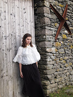
This is my favourite image and I feel it sums up the project perfectly. There is the figure, with the light shinning through the fabric giving that light quality. By pure chance, the angle of the light meant that the light refracted just above the ear, giving that broken rainbow effect. I then filled the sky with one of my photoshop generated patterns, and used the brush to add an illustrative quality to the foreground of the image. I like the ofset layers as they give that blurry risograph effect. I did want to have a go at playing around with the risograph, but the way my time panned out I didn't have time to try it out properly.
This is my favourite image and I feel it sums up the project perfectly. There is the figure, with the light shinning through the fabric giving that light quality. By pure chance, the angle of the light meant that the light refracted just above the ear, giving that broken rainbow effect. I then filled the sky with one of my photoshop generated patterns, and used the brush to add an illustrative quality to the foreground of the image. I like the ofset layers as they give that blurry risograph effect. I did want to have a go at playing around with the risograph, but the way my time panned out I didn't have time to try it out properly.
Tuesday, 19 February 2013
Layered patterns
I really loved the jagged ice collage, so I used it as a brush to make patterns alongside the watercolour backgrounds. I love the overall effect, the washed out colours and mottled patterns. I like how the reduced pattern looks like frost/ice on windows.
I really loved the jagged ice collage, so I used it as a brush to make patterns alongside the watercolour backgrounds. I love the overall effect, the washed out colours and mottled patterns. I like how the reduced pattern looks like frost/ice on windows.
Monday, 18 February 2013
Monday afternoon lectures
Julie's lectures every couple of weeks on a Monday are so useful, as they always manage to calm me down and reassure me just at the point in my project when I'm getting stressed with where it is going! As you can see from my notes above, it is a time to clarify what needs doing next, and gives me time to write ridiculously large notes to myself - important for the next time I don't know what I'm doing!
Sunday, 17 February 2013
Photoshoot
Was so excited to get out and photograph - I have been loving the project, but sometimes you spend so long sat in front of a computer that it was great just getting some fresh air in my lungs! This is a selection of the yet to be edited images. My favourites are the ones with streaming light as it really shows off my light refaction ideas.
Was so excited to get out and photograph - I have been loving the project, but sometimes you spend so long sat in front of a computer that it was great just getting some fresh air in my lungs! This is a selection of the yet to be edited images. My favourites are the ones with streaming light as it really shows off my light refaction ideas.
Friday, 8 February 2013
Nail varnish experimentation
What started off as just playing with random materials whilst marbling, turned into my main technique that follows through all my work! Funny how just pushing an idea and doing something random can end up with such unexpected results. I found that by dropping nail varnish on water, you get a thin film which you can then push around, creating ice-like patterms. Ive tried different ways of experimenting, using watercolours, collage and scanning to get differing effects.
Thursday, 7 February 2013
Monday morning lectures
I really find our Monday morning lectures very useful, and it is a good time for me to think over ideas - a way to ease yourself into the week, as I find it hard sometimes to get back into my work when I haven't looked at it in a couple of days. A great way to get the creative juices flowing. Above are some examples of the notes I make and what I found useful.
Monday, 4 February 2013
Patterns in photoshop
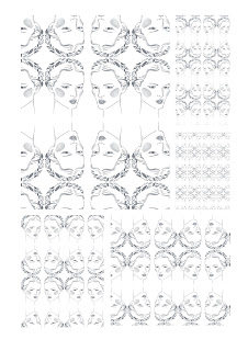
Practising using the brushes and pattern tools on photoshop
using my illustrations from the previous day.
Sunday, 3 February 2013
Fashion drawing - faces
Really liked these drawings once I added watercolour, they are really striking and individual - could see these illustrations fitting into 'Oh Comely'.
Styling and customer profile
The 'Toast' catalogue was my starting point for deciding who my customer was, as I really wanted to do a Toast style outdoorsy photoshoot.
I decided that woman I am design for is the typical reader of 'Oh Comely' magazine - late teens to early thirties, sees themselves as an individual, likes quirky objects, unsual clothing, beautiful laidback styling and film photography. Here are some 'Oh Comely' layout examples - I love the stark simple layout.
Whilst finding my typical customer, I decided to bring together some styling and illustration that will inspire me. I absolutely adore the styling of these Goldfrapp album cover, and would love to reflect something similar in my own work.
Above is the work of 'Igor and Andre', whose handwriting I love, and below are some examples of Laura Callaghan, whose graphic style is really appealing.
Subscribe to:
Posts (Atom)


