Monday 3 December 2012

Evaluation

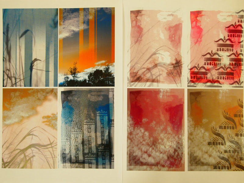
 The theme behind this print module was journeys, so whilst this was the subject of the artwork, it also stands to sum up my whole project - my journey exploring print. Throughout the project I have had to develop my work, trying to combine research and what I had learnt about this new practice into my own work. To begin with my work very much concentrated on the mark marking element, as I looked a continuous line drawing and line within my everyday photographs, but this soon moved onto looking solely at architecture. I looked at various areas of research, but the key influence on my work was the ‘garish’ fashion trend, which I then brought back into my own practice through use of colour, pattern and layering.

The editing process was very important in helping to develop my ideas. For example, I started off with lots of motifs in my sketchbook, from birds to lamp posts, but as soon as I had settled on my architectural theme I kept that as my focus. All whilst doing my print work in the studio, I was simultaneously creating new motifs and designs in my sketchbook to help create fresh ideas which prevented me repeating myself to frequently within my work. I discovered that when I found a technique that I really enjoyed I tended to create more exciting work, such as making digital designs where I found it quite easy to create multiple designs, so I tried to let this practice influence the rest of my work to try and improve the areas in which I was lacking.

My own research was a huge factor in influencing the direction of my work. The content was inspired directly by my surroundings, using the photographs I had taken of buildings on my walks around the city, cutting up the architectural details and then juxtaposing them against each other, before using that as direct inspiration for my motif work. My use of technique was largely directed by what had recently been introduced to us, but I was also inspired by the work of my peers and took their advice on which techniques worked well together and learnt from their mistakes, such as not washing out the reactive dyes thoroughly enough.

I felt overall I organised my project well, utilising the most of my time and using workshops effectively, but I also navigated the project itself well, pushing my ideas and my processes and trying to take the most out of the experience, which left me with a body of samples which I felt rounded up my project very well.

(Can't post photos at the moment as blogger will not
allow me to upload any more images, but will amend
this as soon as possible)

Wednesday 14 November 2012

Manutex and reactive

Ever sinse spotting someone using this technique in the first week I had wanted to try it, and it really fitted in with the watercolour style of my sketchbook. I like the soft quality of the print as all the colours faded slightly when they were steamed giving a very gentle effect. My first attempts were very poor as I had made my reactive dyes too weak, but by the third session using manutex I had got to grips with how each colour would balance out with the dyed grounds.


Below was perhaps my favourite manutex print, as the salt had made lovely pools in the dye - but I had printed it onto the backing cloth (it went straight through the silk) so I had to suffice with a photo. A mistake I didn't make again!


.....


I wish I had started playing around with the reactive dyes earlier on in the project,
as I loved the effects that came out once I started doing tesselated repeats.


Digital

Digital printing is the last process that I had a chance to play around with, and below left is the first test I had with it. I wanted to make the most of the medium, and create something that would perhaps be a little too complex to screen print, so I played around with this repetitive circular idea.


One of the comments in the feedback session was that I should have incorporated more of my early sketchbook work into my designs, so I created these watercolour grounds for working with in digital print, based on the bird-like paintings in my earliy sketchbook work. 


Photoshop 2

I enjoyed the sessions where photographs were introduced into the layers, as I could really bring in this watercolour effect that had been originally difficult to obtain. I chose soft images of grasses and clouds to add subtle texture to the backdrops - something I really enjoyed experimenting with.


Friday 9 November 2012

Wall display

This is the wall display I created for our interim report.
I really wanted to reflect my colour stripe across the wall, and get across that sense
of vivid garish colour that has been so prevalent in my research. I also tried to layout the work in three slightly jolted sections (the digital work, research and croquis, and fabric samples) that connected together to reflect the collaging style of my main motifs. I was quite pleased with the overall look, and it has been useful to help me stop and look at what I have produced so far.


It was also really useful to get feedback from my peers about my work,
as it gave me lots of things to think about in my future work.


Photoshop


Using photoshop to create prints for the first time was an exciting monent, as we were finally able to bring colour into our designs. I thought it was great that you create a selection of colours to match your colour stripe and brushes from your own drawings which are then applicable in so many formats.

I began using brushes that were very similar to my screen designs, which was fun but ultimately didn't make the most of the resource, so above is a selection of photoshop designs that were created using two new brush sets using graphite sticks and watercolour, a change from the graphic shapes of my original gouache and pen motifs. I really enjoy how quickly you can build up a range of samples, and yet it is something that can very easily consume your time - the images above are a collection of four or five different sessions where I went in to work on the computers.

Patternity

Found out about this amazing blog, that posts interesting images that contain pattern.

Monday 5 November 2012

Further inspiration

Thinking back to colour again, I took these images the other day when walking home, and the way the light bounced off the buildings made me think of my colour stripe, but also gradation, in the sense of sunsets.


So I found this sunset photograph I took over the summer, and I am going to try and incorporate some of this feeling in my digital prints.


I have also been looking at some of the designs by Frinton Press designers, and I really like their simplistic, pared back layouts.


'Frinton Press' prints

Sunday 4 November 2012

Direct dyeing

It has taken me a little while to get to grips with, but I have finally found I rather like direct dyeing. My first samples came out a rather violent orange, but with practice I am now able to create a more subtle range. As I feel I have been working almost exclusively with the oranges and blue in my colour stripe up until this point, I have dyed some fabrics in some of the browns and beiges in my stripe (see below) and since then gone back to combine the two in a dip dye format - ie. orange to brown.


Screen printing - pigment

My primary reason for using pigment first, was that its simplicity gave allowances for me to get to grips with using the print room and the screen. This apparently didn't stop me from creating the most hideous first run of prints, of which only a few were salvageable.


But, I learnt from these early rookie mistakes and by the end of my second/ beginning of the third session in the print room I felt more confident with my placement and combinations of colour. Of my pigment prints so far, this is my favourite (below). I feel it captures that garish trend in a pleasing manner, and I like the way the colours blend where they overlap. I know this sort of print would also work particularly well in reactive dyes - something worth testing out.


Monday 29 October 2012

New colour stripe

For ages I had assumed I would base the colours for my collection on my own photographs
of buildings, perhaps focusing on a teal and brown range as this is highly trendy at the moment.
But Nicola suggested that perhaps it was more interesting to do something unexpected,
which got me thinking.

And then I struck upon this image in 'Wrap' magazine, and I just loved the warmth and
vibrancy you could feel from the image, and there is a wide range ofwell connected shades
- the maroon and teal which are on trend, contrasted with the orange to give that 'ugly' feel;
another trend of the moment.


There have been times when I have hated my choice of colour stripe,
mainly because they are not ones I ever usually work with, but I think that has made
me want to persevere even more and see it as a challenge.

Inspiration - trends

Things that have been inspiring me lately,
based around the garish, ugly trend I have been looking at:


This is a great blog I found out about in 'Stella' magazine. I love the bold use of colour in everyday outfits. In this space, the Prada suit that I looked at earlier in the project, which I would view as very high fashion, is worn in an everyday outfit. It has made me think very differently about the eventual use of my designs.


'The Ugly Truth' - Style magazine


'Things are getting Fugly' - Company magazine, October

I found both these articles on this current 'fashion - ugly' trend so interesting. I'm naturally drawn to pretty, stereotypically beautiful imagery so I think it would be quite fun to look at something very opposite to my natural tastes. Some of the thought provoking quotes from the 'Style' magazine article were that 'ugliness is superior to beauty because it lasts longer' and that it can 'perversely, be attractive'.

Thursday 25 October 2012

Museum visit


Inspirational images from Manchester Museum. I didn't see anything that would neccesarily trasfer into my current work, but it was really good for inspiring me to go and do more work and look at other artists.


However, I did really like the regular layout of these displays - the use of symmetry with the butterflies, and the shells with boxes that slot together very nicely. Perhaps this could inspire some of my own print layouts.


Wednesday 24 October 2012

Illustrator part 2


I like how Illustrator allows you to quite quickly visualise a print repeat. Although it wasn't something we were asked to do, I found it quite useful to help develop the overall shape of my motifs into something that tesselates effectively. I'm really looking forward to adding colour to our work as this will really change the mood of my work.

Illustrator

I was so excited to be trying Illustrator for the first time, as I have wanted to learn how to create my own designs on the computer ever since starting foundation. I have never been particularly gifted when it comes to computer stuff, so I was surprised how naturally this style of working came to me! I found it so impressive how you can create such detailed images just by using rectangles and ellipses.


What I also like about this way of working is how you can take a motif (for example, the one above) and create several different versions very quickly, which gives more time for trying out different styles. I will definitely be using Illustrator a lot more from now on.


Sunday 21 October 2012

Hand drawn motifs


From all the motifs I have been playing around with reccently, it is this style above that I really feel has a strong style. For quite a while I had been concentrating on line drawings and paper cut styles separately, but Teresa suggested that I ought to combine the two to have a good balance in my motifs. It was after this chat that I happened to hit upon this style and I really like it.

The top right image shows the process of cutting up my photographs of buildings to juxtapose the various architectural details. I took this idea and played with it in the motifs above - I really enjoyed experimenting with block shapes and solid line.


Friday 19 October 2012

Photos from my travels


As this project develops, my photography has focused accordingly. To begin with I took pictures of everything, whereas now I seem to be concentrating on what is above shop fronts (see above) as I find it interesting that most people never usually stop for long enough to look at what is above eye-level when you walk down the street.

Monday 15 October 2012

Sketchbook work

I'm really enjoying doing mark-making in my sketchbook, and more specifically this process of carrying on the patterns of an image with watercolour. I think this instinctive sort of work carries on with this idea of 'taking a line for a walk' and I'm hoping it will transfer into print quite well.


Architecture - old vs new

My focus for the journeys project during print has been the journey of line in architecture, and it was these photos which I took whilst wandering around the city centre that inspired me to look at this subject matter.


I love the contrast between the glass and metal buildings of recent times,
and the carved stone pieces of times gone by.