Thursday 15 January 2015

Live projects

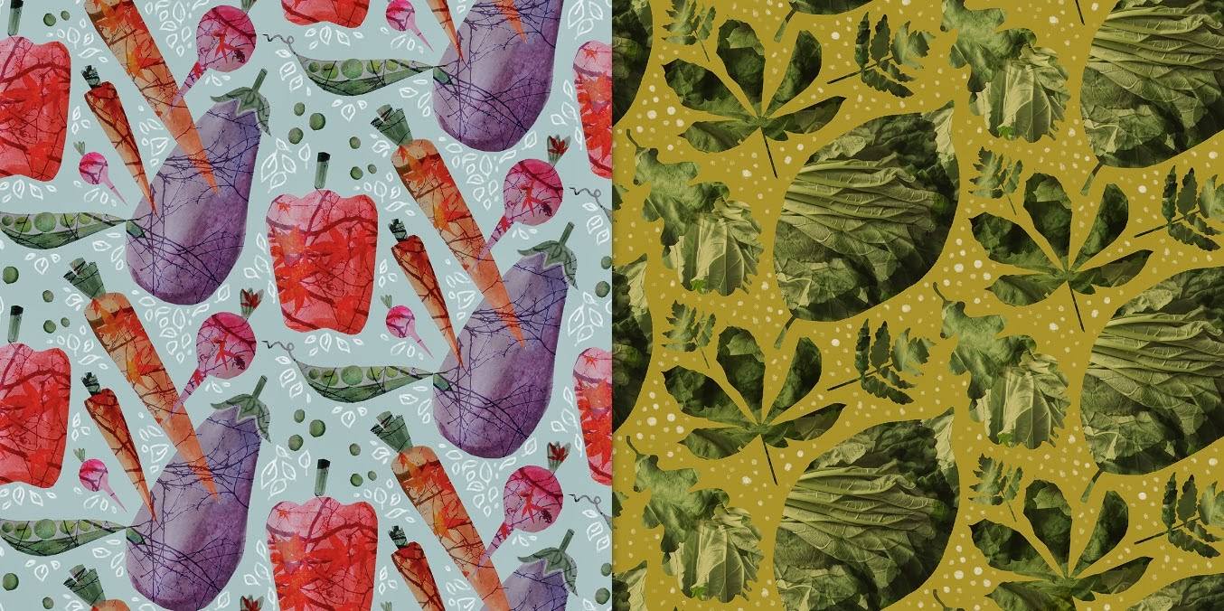
Entering online print competitions has given me a good break from the monotony of working on my main project lately. I thoroughly enjoyed both the Front Row Society and Textile Federation projects as they were inspiring themes that came with a wealth of imagery. I found it useful practicing print-making with photographic elements as I have mainly been working on drawings in my project. As fun as it has been having a break from my usual work, it has also given me a chance to practice other styles of working, and to remind myself of where I see myself after university. 


Even though I hated doing the prints for the Lacuna Press competition, as I mentioned in a previous post, I actually won the competition and was asked if I could have my designs listed on the designed fabric section of their website. This is really exciting as not only is it the first proper step towards my design career, but it also shows that it is worth entering every competition even if it is not particularly enjoyable at the time.


Reflecting

When I went round town for the shop report I realised that I didn't feel very inspired by the shapes I was seeing, and and it made me rethink my idea of just doing womenswear collections for high end and high street. I really want to use this project to create something different and exciting, alongside being able to show that I can do commercial design. I know that I want to do scarf designs again as that has been successful in the past, but I also want to branch out, so I have decided to widen this into fashion accessories, but I will also stick with doing one high end womenswear collection for variety. After quite some thought I realised that handbag linings will be the perfect vehicle for my busier prints, as I can create something quite simplistic on the outside that reveals a wealth of treasure once you open it. 

Womenswear research


Handbag research

The things that I found most interesting when researching clothing shapes was the use of panelling and contrasting textures - lots of sheer sections in unexpected places. There was also lots of unusual hemlines that were longer at the front or back. I think it is these subtle details that rather than an in-your-face print that makes something high end stand out, so I will make sure to incorporate some of these elements in my designs. 

When it came to handbag research however I was even more uninspired by what is on the market, which seems to be flooded with basic tote shapes and boxy designs, excluding the odd unusual shaping from Alexander McQueen and Stella McCartney. I chose instead to focus on vintage handbag shapes, which lead me to look at some really interesting history books where I discovered lots of interesting things about the origins of handbag shapes which will feed back into my design work. As I am planning on designing a simple exterior to contrast my busy linings, I think I will need to try sourcing some leathers and suedes to experiment with. 


Visualisations


Left: plaster head (own image), Right: own drawing.

I have been mulling over how best to display my work in context other than just the usual standard flat illustration, as I want to differentiate myself from all the other print designers on the market. I was inspired by my digitally drawn Staffordshire dog to try recreating a mannequin head to display my scarves on, as I could then place the head among other items on a shelf to create a feedback loop within my designs. I was super pleased with the final result, partly as it looks so similar but mostly because I think it is a quirky and unusual way to show off my designs - something that will make people stop and look at my work wondering if it is real or not. 


Left: La Casita de Wendy, Right: own drawing.

I've chosen a more conventional route for my womenswear designs as I want to show that I have many qualities as an illustrator. I really liked the unexpected splash of watercolour in La Casita de Wendy's lookbook, so I tried to recreate a more toned down version with my own graphicly simple drawings. Although I like the concept, I think my designs don't stand out enough so I think these will need more development.

3D

I have been thinking for a while for the most interesting way to display my motifs within prints, as I don't want to get stuck in boring repetitive styles, so I have found looking at non-textiles artists a really good way to come up with innovative ideas. 


Left: Joseph Cornell, Right: own design.

It has been mentioned a few times about adding shadows and authentic labelling onto my designs to help make my 3D tablet drawings stand out, so I looked at Joseph Cornell's Shadow Boxes as he combines different objects in a collector's format. I found this helped influence the print above as it helped me get my head around where to place shadows to introduce perspective in my work.


Left: image from book, 'How to Wrap Five Eggs', Right: own design.

In some prints I want to use traditional looking formats to show motifs, such as shelves and cabinets, but I also wanted some more interesting ways to show my work. I was recommended to look at 'How To Wrap Five Eggs', a book on Chinese wrapping, which gave me plenty of different ideas for showing objects together, and led to this macrame inspired print above. Looking at unusual inspiration has helped me to look at my motifs in a non-traditional way, which in turn has inspired me to create much more varied work. 

Live Projects


The Lacuna Press 'Vegetables and Trees' competition and the Patternmash 'Prints of Persia' project are two examples of live projects I have been working on in the past few weeks where I really didn't enjoy creating the designs. I found the veg one a real challenge as it wasn't a theme I would ever pick, but it was good to push myself to prove that I can create good prints even when its hard to engage. I think it also shows my versatility as a designer as I have proved I can work to challenging deadlines.


'Prints of Persia' was difficult in a different sense, as I really thought I'd enjoy this theme but I struggled to make the motifs look how I had imagined them. I feel pushing through on these sort of short live projects has taught me a good lesson in perseverance, as I was even prouder of eventual prints I created as I had gone through such a struggle to get to that final point. I really appreciate the importance of live projects as with each one I am getting more confident with my style and use of techniques.

Review week


Preparing for review week has given me a really good chance to reflect on what I have done so far and made me realise that I have achieved much more than I thought I had. I had been feeling like my project was a bit all over the place as I have been using so many techniques, but grouping images helped me to see where clear collections are coming together. Being able to succinctly describe my work to a group of people who haven't seen it before was also useful as it made me concentrate on what is most important.


I decided to put together some visualisations to display my work in context for the purpose of the presentation, but I don't think they were overly successful as they just look a bit childish and don't really reflect my concept. I plan to do more research into different styles of illustrations so that I can create something that fits better with my work.