Wednesday 14 November 2012

Manutex and reactive

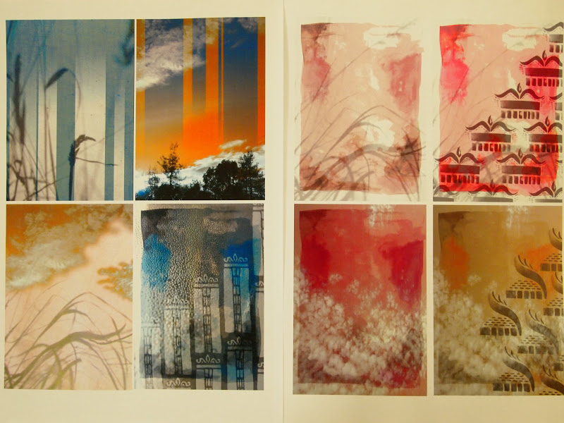
Ever sinse spotting someone using this technique in the first week I had wanted to try it, and it really fitted in with the watercolour style of my sketchbook. I like the soft quality of the print as all the colours faded slightly when they were steamed giving a very gentle effect. My first attempts were very poor as I had made my reactive dyes too weak, but by the third session using manutex I had got to grips with how each colour would balance out with the dyed grounds.


Below was perhaps my favourite manutex print, as the salt had made lovely pools in the dye - but I had printed it onto the backing cloth (it went straight through the silk) so I had to suffice with a photo. A mistake I didn't make again!


.....


I wish I had started playing around with the reactive dyes earlier on in the project,
as I loved the effects that came out once I started doing tesselated repeats.


Digital

Digital printing is the last process that I had a chance to play around with, and below left is the first test I had with it. I wanted to make the most of the medium, and create something that would perhaps be a little too complex to screen print, so I played around with this repetitive circular idea.


One of the comments in the feedback session was that I should have incorporated more of my early sketchbook work into my designs, so I created these watercolour grounds for working with in digital print, based on the bird-like paintings in my earliy sketchbook work. 


Photoshop 2

I enjoyed the sessions where photographs were introduced into the layers, as I could really bring in this watercolour effect that had been originally difficult to obtain. I chose soft images of grasses and clouds to add subtle texture to the backdrops - something I really enjoyed experimenting with.


Friday 9 November 2012

Wall display

This is the wall display I created for our interim report.
I really wanted to reflect my colour stripe across the wall, and get across that sense
of vivid garish colour that has been so prevalent in my research. I also tried to layout the work in three slightly jolted sections (the digital work, research and croquis, and fabric samples) that connected together to reflect the collaging style of my main motifs. I was quite pleased with the overall look, and it has been useful to help me stop and look at what I have produced so far.


It was also really useful to get feedback from my peers about my work,
as it gave me lots of things to think about in my future work.


Photoshop


Using photoshop to create prints for the first time was an exciting monent, as we were finally able to bring colour into our designs. I thought it was great that you create a selection of colours to match your colour stripe and brushes from your own drawings which are then applicable in so many formats.

I began using brushes that were very similar to my screen designs, which was fun but ultimately didn't make the most of the resource, so above is a selection of photoshop designs that were created using two new brush sets using graphite sticks and watercolour, a change from the graphic shapes of my original gouache and pen motifs. I really enjoy how quickly you can build up a range of samples, and yet it is something that can very easily consume your time - the images above are a collection of four or five different sessions where I went in to work on the computers.

Patternity

Found out about this amazing blog, that posts interesting images that contain pattern.

Monday 5 November 2012

Further inspiration

Thinking back to colour again, I took these images the other day when walking home, and the way the light bounced off the buildings made me think of my colour stripe, but also gradation, in the sense of sunsets.


So I found this sunset photograph I took over the summer, and I am going to try and incorporate some of this feeling in my digital prints.


I have also been looking at some of the designs by Frinton Press designers, and I really like their simplistic, pared back layouts.


'Frinton Press' prints

Sunday 4 November 2012

Direct dyeing

It has taken me a little while to get to grips with, but I have finally found I rather like direct dyeing. My first samples came out a rather violent orange, but with practice I am now able to create a more subtle range. As I feel I have been working almost exclusively with the oranges and blue in my colour stripe up until this point, I have dyed some fabrics in some of the browns and beiges in my stripe (see below) and since then gone back to combine the two in a dip dye format - ie. orange to brown.


Screen printing - pigment

My primary reason for using pigment first, was that its simplicity gave allowances for me to get to grips with using the print room and the screen. This apparently didn't stop me from creating the most hideous first run of prints, of which only a few were salvageable.


But, I learnt from these early rookie mistakes and by the end of my second/ beginning of the third session in the print room I felt more confident with my placement and combinations of colour. Of my pigment prints so far, this is my favourite (below). I feel it captures that garish trend in a pleasing manner, and I like the way the colours blend where they overlap. I know this sort of print would also work particularly well in reactive dyes - something worth testing out.