Wednesday 3 December 2014

Large scale

I mentioned in a previous post that I wanted to try working on a larger scale to loosen up my drawing style, so this week I bought a roll of wallpaper and some tester pots, and spread myself out on the studio floor. I carried on with the theme of repetition I have been playing with recently to force myself to paint the same thing over and over, which was very freeing as it made me focus on the medium rather that being precious about the visual. I think I will try to work on a large scale more frequently as I like that although the images look messy, once they are scaled down and put into prints they will retain their interesting texture and details. 


I used the leftover paint to create coloured sheets to collage with, in the style of Mark Hearld. I find I often limit myself to working with just watercolour paints as they are always to hand, but I have enjoyed trying out other paint techniques as I have discovered a different way to incorporate texture into my work, which will bring some much needed life into my otherwise often flat, boring imagery. 


Left: Mark Hearld collage, Right: own collage

Repetitive photography


As part of my attempt to push my use of techniques, I decided to play around with photographing objects in different patterns. I have found physically playing with elements has been a good way to think about my print layouts in a more inventive way. I also think I have been limiting myself to just old objects, whereas collections of mundane objects are just as intriguing, and may be a good way to bring a different angle to my work in the future. 

Narrative


Left: drawing, Right: Plate from Preston Museum

Narrative is something that has been mentioned a lot in my tutorials but I have really been struggling to work out how to incorporate story telling into my designs. I was inspired by some antique plates to tell a story through portraits combined with images, so I drew a few of my friends and their belongings in the style of the plates I was inspired by. I think these were successful as they give you an insight into the person in the centre of the image, but the limited colours prevents it from looking too confusingly busy. 


Left: Plate from Bowes Museum, Right: plate design.


Organising by type


In the project so far I have just been drawing which ever objects take my fancy, but I wanted to try picking motifs specifically for a print, rather than just hoping that they would go together as an after thought. I carried on my watercolour/collage technique here to give myself a limited colour palette, and found organising objects by type (such as animals) a good way to create a coherent set of objects, which gelled together well when I dropped them into a practice print layout. 

Thursday 30 October 2014

Patternmash Designer Spotlight

Over the past few months I have been working on creating prints for Patternmash, which has really helped me to practice working quickly and efficiently to create prints for different briefs, and expanded my repeat print skills. The challenge of creating prints for themes I wouldn't have chosen has pushed me to experiment with my work and given me the confidence to design on a quick turnaround, even though I do not necessarily always personally like what I have produced.

I was recently picked for the site's Designer Spotlight feature, and the process of being interviewed led me to reflect retrospectively on my work, helping me to see how my body of work as a designer is viewed by the outside world. This has fed back into my practice as I have learnt the importance of stepping back and seeing how my project works as a whole. 


Tuesday 14 October 2014

Collections

As I have been visiting different museums to collect imagery for my 'heritage' theme, I have come to realise that it is not necessarily the objects themselves that I am usually interested in, but the way they have been displayed. The pattern-maker side of me has been drawn to the way objects are laid out - I found it interesting to see how objects are displayed in a museum as opposed to how the exact same items would be displayed in a personal collection. After conversations in tutorials I have decided that I want my theme to focus on the 'collecting' side rather than just objects of age, as I think this will give me more of an interesting concept.


Manchester Museum (own image)

Now that I have chosen to focus on collections, I thought it was important to start putting motifs together to see how they look collectively. I was inspired by Sarah Cwynar's photography to order objects by colour, and although I like how the different shades of one colour reflect off each other, I think I need to find a way to make my work look less flat, as I feel it currently looks very uninspiring and expected.


Left: Sarah Cywnar, Right: (design work)

Sunday 12 October 2014

Techniques


One of the things I wanted to tackle first from my learning agreement was making myself be more experimental with my techniques, as I often get stuck in a rut of fineliner pen, watercolours and drawing on a small scale. As I really got into collaging over the summer, I decided to combine this technique with one of my old favourites, using sheets of watercolour painted paper and stitch to create a textured image. I also tried to work slightly bigger than usual (this piece is around A3) which I found very freeing as I could be looser - I really want to push this further in the project and do more with scale. 


I received a graphics tablet over the summer, and using this to draw straight onto my laptop has totally changed the way I work. I decided to push my new found technique to try and draw something hyper-realistic, copying museum items and also making my own objects from images of real animals (such as the horses above) which I think worked especially well in my depiction of this Staffordshire ceramic dog, as the soft brushes give a very realistic glaze effect. 

Friday 10 October 2014

Heritage and heirlooms

I found it hard over the summer trying to come up with a project theme as I knew I would have to stick with it throughout this long project - I don't want to risk getting bored. I picked 'Heritage and Heirlooms' as I always find old objects inspiring to work from, and I have always found the past brings me lots of things to work from. Writing the first draft of my learning agreement has been an interesting task as it is quite daunting planning an entire project to last for several months: I will be intrigued to see how my work and ideas develop over the course of the project.

It was really useful creating the boards for the initial hand in after the summer, as it helped me summarise visually what I want to achieve, and I realised that I actually have a strong idea of what I want to create. I'm looking forward to getting stuck into the creativity of responding to my visual research, and my first aim from the learning agreement is to play and experiment with my techniques so that I am pushing myself from the very beginning. 


Thursday 7 August 2014

Degree show review - part 3

Claire Florey-Hitchcox


Although in my own work I tend to stick to digital print, I fell in love with Claire's woodblocks when I saw them in the degree show. I was astounded by the incredible amount of detail that was obtainable on  a surface as unforgiving as wood. I like to include multiple motifs in a design, so I was really interested to see how she had interwoven hundreds of objects to create one flowing pattern. I really liked how when you first look you just see overall pattern and then it is only when you look closer that you see all the objects. I really enjoyed her use of placement, as the combination of simple spots and stripes was a perfect way of framing the busy content. The reduced colour palette also helps to balance out the busy pattern. I think this could influence the way I use colour and motif placement in my own work, as I think flattening the imagery would be really effective way of varying my print designs. 

http://clairefloreyhitchcox.wix.com

Degree show review - part 2

Hollie Louise Davies


Hollie's work most definitely stood out to me as interesting and different to your average fashion print. Whereas Bethaney's prints were obviously pretty by nature (due to the use of florals) Hollie's prints seemed feminine yet bold and modern, with a real high end feel about them. I adore her use of colour, the orange, yellow and aquamarine shade of blue really stand out and draw the eye towards them, and has really inspired me to be more brave with my choice of colour in the future. I really liked the mix of prints in the collection, and it showed me how really simple prints can looked really interesting when mixed in with the more intricately detailed prints. Yet again the styling, photography and use of displacement on photoshop was especially inspiring, but what I loved the most was how Hollie had clearly really thought about the garments and how texture (such as pleats) would work with different prints. My own work is often very heavily based on motifs, whereas Hollie's interesting use of paint marks and watercolour/ink has inspired me to think more abstractly about my designs. 

http://www.hollielouisedavies.com

Degree show review - part 1

Bethaney Lauren Barrie


I really liked Bethaney's work, as you really can't beat a good floral. I loved everything about her prints, especially the way she made florals look so modern - the use of scale, bright and vivid colours and texture was spot on for me. I love the overall look of her lookbook, as the pared back and simplistic photography really shows off her prints; and the fact that the photography is her own shows that she has many talents outside of being a print designer. I thought her use of displacement was really skilled, as it really looks like the fabric has been printed, and her use of various garments and accessories shows the versatility of the prints. I like the fact that Bethaney explored so many methods, from photography to collage to animation, and I hope this will inspire me in third year to keep my mind open so that I don't feel I just have to focus on one thing. It has also really made me want to do some photography and styling this year, as it is something I have intended to do in previous projects but never achieved.

http://bethaneylauren.weebly.com

Tuesday 20 May 2014

Blog posting 3 - REFLECTION


This project has opened my eyes to a world of opportunities and has led me to realise that as a freelancer the possibilities can be endless if you are open to working with other people. Before this project I would never have thought of putting my prints onto ceramics, and I feel I have learnt more about 3D design in general, which has led me to think about how my practice fits into the wider commercial design world, and considering my work outside of the confines of fashion print.

I have also discovered that varying my working routine can benefit my final product, as although it is good to have a method that works I have realised that it is also important to work in a way that suits the project – for instance, I usually stick to research, drawing, then printmaking, but in this project I started doing printmaking earlier on in the process, and then went back and did more drawing and research, which led to a more considered 
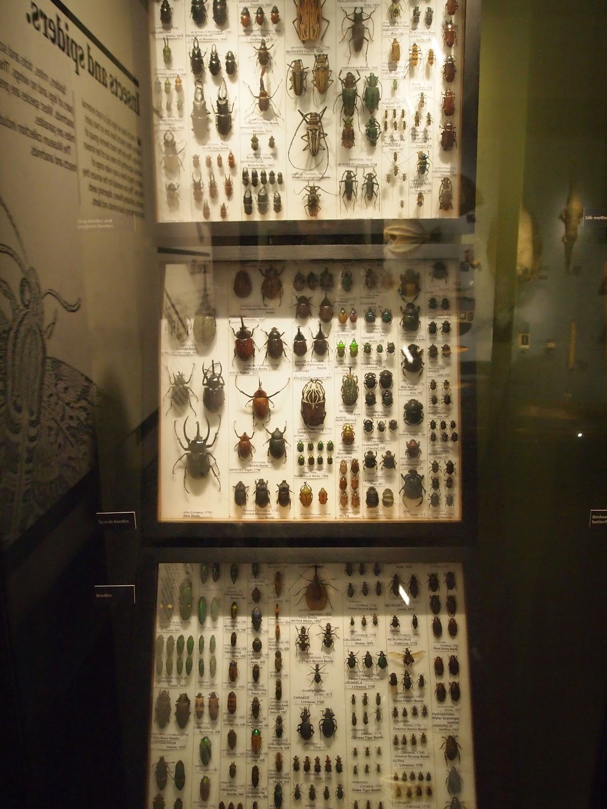
final product. Having never worked on such a large scale before, it was a steep learning curve understanding how my seemingly tiny prints on a computer screen would look printed full size.

I really tried to fully immerse myself in the project, as I really wanted to design a strong response to the client brief. I feel I engaged very well with my theme mainly because I did plenty of research throughout the 
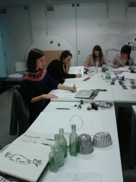
project, so I had plenty to work from. I thoroughly enjoyed the workshop activities, as it was a great reflection on the world of networking, and the fact I got plenty of feedback from potential collaborators shows I was able to sell my ideas well. I found the mixing and changing of the tutorial groups really beneficial, as you got the input of a wider range of people, and I felt I had plenty of comments to offer in the early project stages. Even though I didn’t collaborate with anyone on the end product, I felt I always had a strong team of people around me that were involved in every stage of the design process. I was quick to offer others my knowledge, such as helping Eden with Photoshop and discussing our InDesign woes, and comparing ideas with Julia, but I also benefitted from group collaboration, such as the drawing workshop.

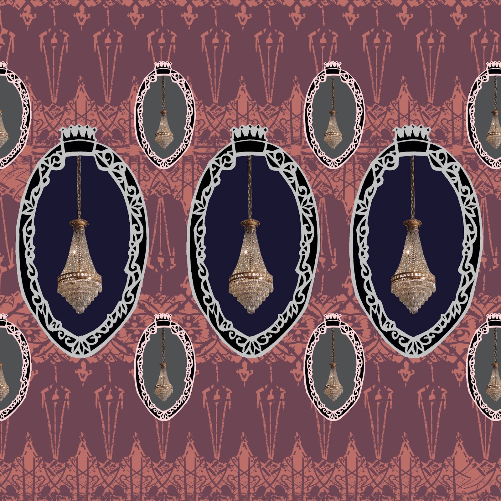
I think overall I made good choices when it came to my final designs; I thought hard about print placement and considered where to place images so that they were the right way up when the scarf is worn, and understood that product research was key in helping me understand this. I also 
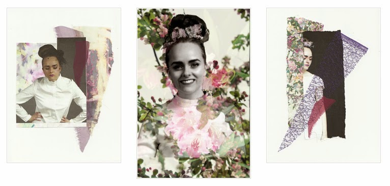
think the choice to combine photographs and drawings worked really well, particularly in my illustrated visualisations, as it immediately gave the viewer a feel for the theme. I was pleased with the fabric choice, but I feel I should have done more fabric testing to prevent the colours coming out wrong in my digital prints. I also should have taken into consideration the open weave of the cotton voile and therefore avoided finer line that is easily lost.


I think I could improve upon my attention to detail within my design work, which was sometimes lacking – having never designed on such a large scale before, I didn’t quite realise how much a small mistake would be magnified on the final product. I would also like to improve upon my InDesign skills, as I attempted to create a publication but in the timescale it was too much work to do at once, so I ended up having to drop it.

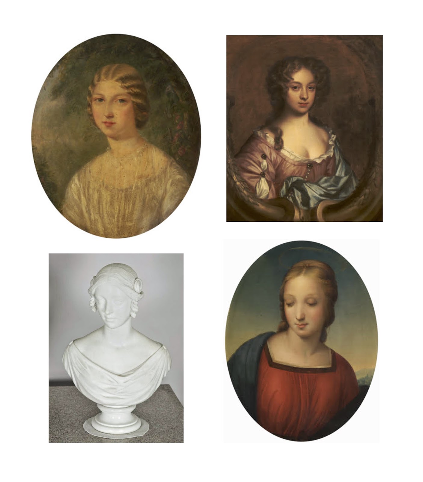
Creating a coherent collection that reflected my aim to create my own baroque patterns using ambiguous objects inspired by the National Trust, was as important to me as making a saleable end product. I have discovered that I really enjoy combining unexpected items and motifs into historically inspired patterns, and this is a theme I would like to continue in future work. My other key motivation in this project was to create a product that was market ready, as I wanted to prove to myself that being a freelance print designer could be a viable option when I leave university. Thinking about the branding for example, has made me think about the product as a whole and has made me realise that I could actually see myself having my own brand in the future. 


Wednesday 14 May 2014

Exhibition prep

Now that my collection has been finalised, this week has just been all about getting ready for the exhibition. I decided to pick just two to print, choosing one dark and one pale so as to reflect both sides of the collection. I did have to over come a few problems however, as I had to make my prints smaller as the new roll of cotton voile fabric that came in was smaller than usual. So my digital fabric prints are now around 140cm x 50cm, which is obviously is a scaled down version of what I had designed them to be but still displays how my prints would look as an end product.


After Sally suggested I continue the branding I started looking into in the last project, I decided to mock  up a box to help show how the scarves would be sold. Below is the lid I designed, based on elements of the scarves, and designed to show off the baroque element of the project. 


Visualisations


I knew that I needed to show my scarves as visualisations to show what they would look like as a final product, but it took me rather a while to decide what medium would be appropriate for the project. I didn't want to just put them on simple photographs, I really wanted the visualisations to be as interesting as the scarves themselves, without overpowering the prints. I was so pleased when I hit upon the idea of doing illustrations of women from Taton Park, using portrait paintings and sculptures from the National Trust archives as a basis for my stylised drawings. I think it is a perfect way to tie together the project, and would be a great way for each individual Trust shop to display these scarves, as they could use portraits based on the historic people from the site. I also think the combination of using Photoshop displace on a photo of fabric against the illustration worked well, as it ensures that the scarf is what stands out. 

Thursday 8 May 2014

Final Designs


These are the final 8 designs for the scarf collection. I decided to choose 4 blue/green designs and 4 pink/purple designs to have a nice balance of contrast in the collection. I'm really pleased with the final outcome as I think it perfectly fits everything I was hoping to achieve - a baroque feel inspired by and using elements from the National Trust Archives and Taton Park, traditional enough to appeal to current customers, but with a modern twist that would bring in younger customers too. As the scarves are designed to be produced at a 180cm x 70cm size, it can be hard to see the detail in the images about, so below are some close ups of the prints to show some of the detailed motifs used. 


Tuesday 6 May 2014

Digital print experiments


So I began to have a play around with the baroque frame motifs I had made, and as pretty as they are, they felt a little flat and I simply just don't like them. As I don't use brushes very often I've been finding it tricky to make them do what I am visualising in my head, so I tried to play around with them a bit more, add a few more layers and a better mix of colours. 

Above is a selection of prints I made using the changes I previously mentioned, and I think this more varied approach has been very effective. I like how the prints use a lot of bright colours yet the combination and ratios they are not overpowering or lurid, which I think would appeal to current National Trust customers, yet also target a younger market. I want to push these designs further so that I have an interesting mix to choose my final collection from.


Friday 2 May 2014

Blog posting 2 - INVESTIGATIONS


In the past I have generally stuck to drawing and painting as a starting point for motif making, as I know it is a system that works well for me; but I have found it very beneficial taking a different approach and being more experimental early on in the project as I have created some striking imagery to work into my prints. I have learnt that it is also good to vary my content, and I think that more bold and graphic motifs contrasted with my usual softer line drawings will create some interesting prints. I really enjoyed using collage in my last project, so it has been good to further push my skills with this technique. Doing the Patternmash brief has also really helped my work, as I started to think about the layout of prints much earlier than I usually would in a project; in the future it may help to start playing around with print layouts at the same time as drawing motifs so that I can create drawings for a particular purpose, rather than my usual pattern of drawing then print making.


Even though I did not collaborate with anyone to create my final product, the collaborative side of the project has had a big impact on my work. The fact that there were very few other print students who picked this option meant that I’ve pushed myself to interact with students from other areas. I have found it really beneficial seeking advice and opinions from the weave students as they have a very different approach to textiles (for instance, I would usually have not have considered making my own tassels for my scarves before they suggested it), and I feel I can offer them more design based advice, such as helping Eden with her Photoshop skills. On plenty of occasions I have met up with illustration student Julia to talk through our ideas, which has been so useful to get her opinion on my work as I have a very illustrative style, and she has made me realise that there are many options out there other than just fabric-based outcomes. This is also the case with talking to the 3D design students; it has been so interesting seeing their take on the project, and even though I haven’t ended up collaborating with a ceramics student, I felt that the collaborative drawing workshop we did really helped to kick start ideas in my project. I definitely think that I would like to collaborate with students from other disciplines again as it has made me look at my own practice with fresh eyes.


I have played around with materials and drawing styles in this project, using papercuts to create lace-like patterns that could be turned into brushes on Photoshop. After playing around with different techniques I decided I wanted to reflect this strong graphic feel in my drawings, so I used pen and gouache to make drawings that looked like they could be paper cuts. Although they would translate very well as screen prints, I want to use Photoshop for its ability to really layer up stencil images with drawings, textures and photographs. 


I loved the idea of collaborating on a ceramic piece with one of the 3D design students, but discussions with tutors made me realise that it would benefit my practice to work further with scarves, and in the time scale of this project it made more sense to work with techniques that I already know to create a really slick end product. I have designed square scarves in the past but they are usually placement prints designed to focus on the corners, whereas long scarves are worn totally differently, so I want the focus of the print to be on the ends. I understand the importance of knowing my market place, so I did further research to see what type of scarves the National Trust already sell, looked at high street stores for a price range comparison, and looked at higher end brands for pattern, scale and colour inspiration, all of which has given me a clearer idea of what I think will sell well print-wise. As one of the key points of a prints success is the colour, I have spent tome putting together a colour palette that I think reflects the project, with a mix or muted and brighter colours.


I definitely want to digitally print some of my scarves to show the viewer how my prints would look in a final context, so to do so in time I have made a day-by-day plan of what needs doing so that my fabric can be printed in time for the exhibition. This means that in the next few days I really need to concentrate on creating prints so that I can swiftly move onto finalising designs.