Monday 29 October 2012

New colour stripe

For ages I had assumed I would base the colours for my collection on my own photographs
of buildings, perhaps focusing on a teal and brown range as this is highly trendy at the moment.
But Nicola suggested that perhaps it was more interesting to do something unexpected,
which got me thinking.

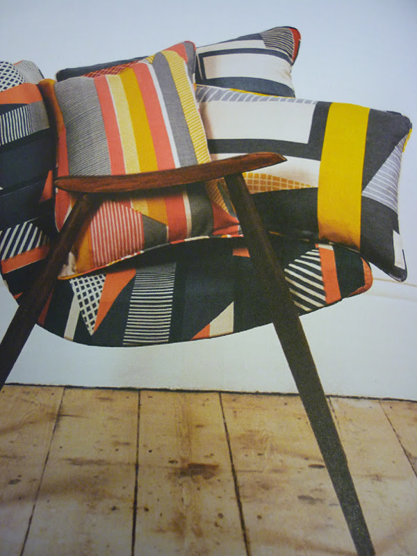
And then I struck upon this image in 'Wrap' magazine, and I just loved the warmth and
vibrancy you could feel from the image, and there is a wide range ofwell connected shades
- the maroon and teal which are on trend, contrasted with the orange to give that 'ugly' feel;
another trend of the moment.


There have been times when I have hated my choice of colour stripe,
mainly because they are not ones I ever usually work with, but I think that has made
me want to persevere even more and see it as a challenge.

Inspiration - trends

Things that have been inspiring me lately,
based around the garish, ugly trend I have been looking at:


This is a great blog I found out about in 'Stella' magazine. I love the bold use of colour in everyday outfits. In this space, the Prada suit that I looked at earlier in the project, which I would view as very high fashion, is worn in an everyday outfit. It has made me think very differently about the eventual use of my designs.


'The Ugly Truth' - Style magazine


'Things are getting Fugly' - Company magazine, October

I found both these articles on this current 'fashion - ugly' trend so interesting. I'm naturally drawn to pretty, stereotypically beautiful imagery so I think it would be quite fun to look at something very opposite to my natural tastes. Some of the thought provoking quotes from the 'Style' magazine article were that 'ugliness is superior to beauty because it lasts longer' and that it can 'perversely, be attractive'.

Thursday 25 October 2012

Museum visit


Inspirational images from Manchester Museum. I didn't see anything that would neccesarily trasfer into my current work, but it was really good for inspiring me to go and do more work and look at other artists.


However, I did really like the regular layout of these displays - the use of symmetry with the butterflies, and the shells with boxes that slot together very nicely. Perhaps this could inspire some of my own print layouts.


Wednesday 24 October 2012

Illustrator part 2


I like how Illustrator allows you to quite quickly visualise a print repeat. Although it wasn't something we were asked to do, I found it quite useful to help develop the overall shape of my motifs into something that tesselates effectively. I'm really looking forward to adding colour to our work as this will really change the mood of my work.

Illustrator

I was so excited to be trying Illustrator for the first time, as I have wanted to learn how to create my own designs on the computer ever since starting foundation. I have never been particularly gifted when it comes to computer stuff, so I was surprised how naturally this style of working came to me! I found it so impressive how you can create such detailed images just by using rectangles and ellipses.


What I also like about this way of working is how you can take a motif (for example, the one above) and create several different versions very quickly, which gives more time for trying out different styles. I will definitely be using Illustrator a lot more from now on.


Sunday 21 October 2012

Hand drawn motifs


From all the motifs I have been playing around with reccently, it is this style above that I really feel has a strong style. For quite a while I had been concentrating on line drawings and paper cut styles separately, but Teresa suggested that I ought to combine the two to have a good balance in my motifs. It was after this chat that I happened to hit upon this style and I really like it.

The top right image shows the process of cutting up my photographs of buildings to juxtapose the various architectural details. I took this idea and played with it in the motifs above - I really enjoyed experimenting with block shapes and solid line.


Friday 19 October 2012

Photos from my travels


As this project develops, my photography has focused accordingly. To begin with I took pictures of everything, whereas now I seem to be concentrating on what is above shop fronts (see above) as I find it interesting that most people never usually stop for long enough to look at what is above eye-level when you walk down the street.

Monday 15 October 2012

Sketchbook work

I'm really enjoying doing mark-making in my sketchbook, and more specifically this process of carrying on the patterns of an image with watercolour. I think this instinctive sort of work carries on with this idea of 'taking a line for a walk' and I'm hoping it will transfer into print quite well.


Architecture - old vs new

My focus for the journeys project during print has been the journey of line in architecture, and it was these photos which I took whilst wandering around the city centre that inspired me to look at this subject matter.


I love the contrast between the glass and metal buildings of recent times,
and the carved stone pieces of times gone by.


Monday 8 October 2012

Fashion print

Here are two of the graphic prints I really liked form the journals I looked at. The first one, by Eley Kishimoto is vibrant and exciting, yet so simple in terms of motif. The second, a suit for Prada, shows how a high end fashion range can really push the boundaries in a way that isn't saleable for the high street.


Both these prints are bold and fit the garish trend well - if I want to
recreate this sort of idea in my own work I clearly have to concentrate on
contrasting colours.
 

The World of Interiors cont.

I like the simplistic shades in these wallpaper samples, all very monotone. Again the graphic, geometric shapes are repeated but a very strong reference to nature and florals.


The World of Interiors

I have always liked how they show off samples and prints in The World of Interiors, and here are two articles that show off fabrics and wallpapers from the Focus and Decorex fair.


I like how the images above incorporate the landscape and reflect the colouring,
whilst in the images below the fabric is used to starkly contrast the subject matter.

Interesting prints

Here are some prints that I liked from Selvedge and various other journals in the library today. The thing I picked up on most was colour use - I really like this vibrant, bold use of colour.


Prints

As I'm doing the print option, I went out to look for prints out and about in town. In all the clothing stores I went to there was a prominence in bright geometric prints, paisley and dark winter florals. Here are some of the prints from Urban Outfitters.


One thing that struck me throughout all the shops was this odd use of clashing colour (for example, the mustard, blue and maroon at the top) which reflects the trend for all things 'ugly' this season. Perhaps it would be interesting to cite this in my own work?

Visiting Abakans

I found it really interesting visiting the fabric store as it got me thinking about
trends in fabric, pattern, texture and how to incorporate colour.


I really like these mood boards they had up on the wall as well
- they really clearly put across a mood and show that riot of colour.