Monday 30 December 2013

Thoughts about birds....

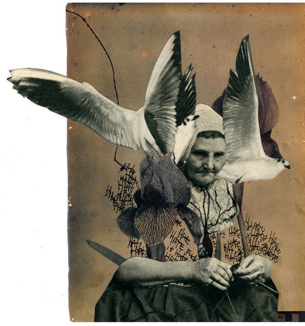
The further along I get with this project the more I have been thinking about bringing in another element to mix in with the historical costume stuff, as I'm concerned about my work just coming across as un-original copies from books. The other day I had a sudden epiphany and realised that birds of paradise would be the perfect thing to combine with the dressing up side of my project - they are extravagant, brightly coloured and extremely over the top, a perfect way to sum up my project visually. I also like how easily it will fit in with the sort of motifs I have already been looking at, a bright and vibrant contrast to the simple black and white line drawings.


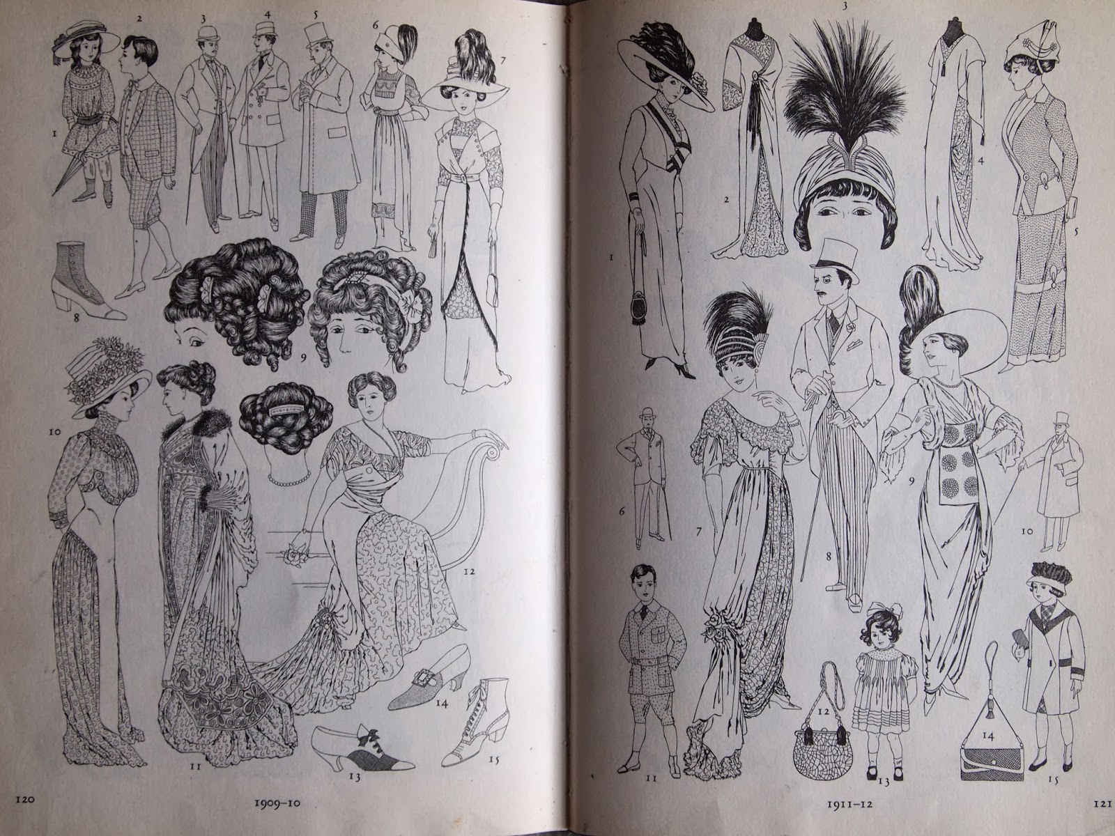
I started off by going to the library, but there was more stuff on (rather plain looking) British birds than the exotic sort of thing I was looking for, but I stumbled across this book that I think could be rather inspiring. It was a book from the 70s about birds from around the world, but the thing I liked about it most was the extreme technicolour shades, all rather incorrect representations of how the birds would really look, but there was something rather fun and exciting about it. I did a ridiculous amount of photocopying, and now I'm thinking about collaging parts of the birds together with other objects to see what effect I can create.


Sunday 29 December 2013

Collage artists

I have seen so many artists doing photo collage floating about online, its definitely something that has got mega trendy lately. Ashkan Honarvar however, is someone whose work I have always enjoyed and I particularly like this very pink piece - I think I just really like the overall feel and the random yet coherent nature of the objects within it. I also really like the piece with the bird, there is something intriguing about the hunched figure of a woman combined with the whimsical drawing style.


I also like the simplicity of this collage by Erin Case - what you see is what you get, and yet there is a lovely balance in the composition, with the texture of the hair and the gentle colours of the scenery. I want to try to reflect some of this quirky style in my own work. 


Sketchbook beginnings


Thursday 19 December 2013

Costume books

I own quite a few second hand books on british historical costume, as it is something I have been inspired by ever since I was small, and although the internet is an amazing tool for finding out things about the past, I really enjoy seeing an older take on what clothes looked like. For example, one of my favourite books is a victorian take on how historical costume looked - useful for accurate information but also incredible to look at as for us this was over a hundred years in the past and therefore belongs with historical costume itself. I feel this fits into my 'dressing up' theme rather well, as many elements of historical costume epitomise that idea of extravagance and being over the top, particularly compared to the clothes most of us wear in the western world today.


Monday 16 December 2013

Locating brief

In this project I aim to design and create a collection of digitally printed silk scarves for a high-end womenswear designer, such as Liberty or Hermes, which shall be displayed with a series of styled photographs. 

Throughout the project I intend to study the theme of 'dressing up', looking closely at the extravagances in British historical costume as a starting point. I shall begin my research by looking at historical books on costume and then bring in broader research, covering topics such as the outrageous, frivolous nature of dressing up and how it is used as a way of transforming the body. I shall develop the concept for the project during the research stages to see what I find most interesting from the theme.

In the early stages of the project I will experiment with drawing and painting to push my illustrative handwriting style. I will then move into digital print using Photoshop, as this is a process that worked well for me in the previous project; but I also wish to improve my skills on Illustrator, using it as a medium to create motifs. The final collection of scarf designs will hopefully combine both hand drawn and digitally created motifs in a coherent manner. I intend to digitally print my final designs, although I may use screen printing techniques in the development process. I shall use sampling to create the final collection of scarves, but which methods I chose should become apparent after the designing stage. I plan to do a test photoshoot earlier on in the project to help develop my styling ideas, before a final photoshoot to display the scarves in a way that appropriately reflects the theme.

Saturday 14 December 2013

Locating project - initial thoughts


When we were first told that we could do whatever we liked this project, I have to admit I did panic a bit. The extreme freedom threw me a bit and it took quite a while before I could even begin to think about what to focus on a theme. After a lot of dithering, I decided to look back to the things that I always have in my workspace to inspire me - my pin boards. The more I looked the more I realised that the key thing across all the images I have collected across the years was the theme of dressing up; that idea of extravagance and being over the top, becoming someone else. Once I went down this route I also realised that for once I had a pretty clear idea of what I wanted my end product to be - illustrated silk scarves. I think this may end up being quite a self indulgent project as it is combining some of my favourite things, but where is the harm in that!


Sunday 24 November 2013

Project overview

When I initially picked 'Future/Past' as my theme at the beginning of the project, I envisioned elegant gowns, studying dress shapes and eventually creating something ephemeral and pretty. What I ended up designing was the complete opposite of that, but I think it is quite exciting to see how such cliche beginnings turned into an unusual prints in bold clashing colours that still manage to harmoniously work together to create the 'Symbols in Time' collection.

I began looking at the 1700s and 1950s after my visit to Platt Hall, and at first I merely studied to see which could go where - I didn't expect to be able to combine both of them together as inspiration for my final prints - and this in itself shows risk tasking, as I took two polar opposites in design history and tried to gel them together. The big moodboards I created for each period played a pivotal role in my project as I came back to them at every step of the journey, allowing me to deeply immerse myself in the 'past' section of the brief. I enjoyed finding out so much about symbolism, and it has given me a totally different view of the world as I now stop and look at motifs and wonder what they could represent. Researching current and past artists and designers work gave me plenty of inspiration, and helped to guide me in a project where I wasn't really sure where I was going.

I have thoroughly enjoyed the challenge that was this project, and feel I really managed to settle into a work routine. Every weekly tutorial made me stop and think about my work and ended up pushing me in a different direction. It also made me realise how important the input of other students was, as without it, my work would have ended up in a totally different place.

I'm really pleased with my final 12 prints, I feel they embody my project but also work in a market sense, as there is an even spread of print styles and colour ways. I'm also very proud of my final technical flats, as this is the first project where I have taken a presentation style and followed it all the way through, from inspiration boards to prints to the name card for wall presentation. I feel this makes my work appear more like a collection as there is a consistency throughout. 

Final work and presentation boards

These are the final 12 prints I selected for the 'Symbols in Time' collection. I felt 12 was a nice balanced number and I think the prints I have chosen best represent my project, the theme and also a good visual range with a mix of placement and multidirectional prints.


I decided to create these two boards to help show the process of my project in an immediately visual way, as in this particular project I didn't have a sketchbook and instead worked on separate sheets. the first is my inspiration for this project, showing the artists and designers who have influenced my work, alongside the brand I have chosen to design my work for. The second shows more of a working progress of my project, to show the journey my project has come on from mood board research, to drawings to colour stripes. I feel that shown together with my final technical flats and prints it will help to sum up my project.

Final technical drawings


These are the photoshop boards I have designed to show my final technical drawings. I trialled this style of presentation earlier on in the project and really liked how it visually ties together all the garments, so I have tried to be consistent and have applied this style to all my final boards. As I have 12 final prints in the collection, I chose to put all of them on both of my flats as I really liked seeing how different prints went together. I like the final look, and I'm pleased with my fabric selections, as I think it would make a nice contrast to have some sweaters in jersey and some slightly more like blouses in a chiffony style floaty fabric. 

Wednesday 20 November 2013

Selecting final prints


After playing around with so many techniques and therefore creating so many prints, it actually made it more hard work to select which ones to use in my final collection. To aid the decision making process, I applied all the prints to flats to see which looked best on garments (as obviously thats the most important part anyway). This somehow made it worse, as I rather liked all of them! But as my project has been quite often about public interaction (for instance, the fact that most of the symbols came from objects people suggested) so I asked people which were their favourites. Its really boosted my confidence in my work having people walk past in the studio and say 'ooh I would wear that', as for a majority of the project I was concerned that I had designed something that no-one would want to buy.


Tuesday 19 November 2013

Final tutorial

I think everyone came to the tutorial feeling rather stressed about their work, and I was personally feeling like my prints simply weren't working, but as usually everything came up roses and I left feeling infinitely better about my work! It was good to get everyone's opinion on my work and some positive feedback always helps, so now I just need to make a structured plan for the week so that it doesn't all get on top of me.

Saturday 16 November 2013

Technical flat layouts


I tried to apply my prints to these tank tops and I actually really enjoyed it. I feel like I'm finally getting to grips with photoshop (its taken a while!). I enjoyed playing around with layouts for the flats, as I feel the appropriate colours and fonts can add to the overall feel of the collection.


Friday 15 November 2013

Square repeats

I feel like I'm over-using the original drawings a bit, so I've decided to draw some fresh motifs (still from the original suggested list) to add to the pile. I've been trying out the technique Alex taught us for making multidirectional prints and I'm very pleased how they turned out.


First repeat prints


Here I put a more traditional style mask around part of my bigger print to create this shape which I hope will tessellate slightly better. I also tried to be more selective with my use of colours, which I think has worked well. I'm very pleased with how the prints turned out below, and I think the selective use of colour makes them much more wearable. 


Thursday 14 November 2013

Market research - Harvey Nichols and Selfridges

Today I went to town to have a look around some department stores for a more high end market for my product, the logic being that you would be more likely to find a large scale complex print from a slightly higher end designer. I discovered a few different designers that I thought matched the level I want to sell my work at.

MSGM

This is an Italian brand who do bold vivid colour, and random geometric prints really well. Tops (the area I am generally sticking with) were around the £200, £300 mark which I think is the part of the market I'm aiming at. 


Finders Keepers

This Australian brand combines a mix of simpler pieces with the odd bold print. Whilst I don't actually like their clothes, I can see how my prints could be pitched at a similar market level.


Clover Canyon

This LA based brand was by far the best thing I saw all day. I can see my prints fitting right into this brand, I love all their bold colourways and especially the handwriting of this prints and motifs themselves. Feel this suits my project better than Topshop ever really did. They are definitely the sort of brand I can see myself designing for in the future (plus all the prints have crazy names like 'Robot Flamingo').