Friday 31 January 2014

Tiger print live project

I decided to focus on the 'female icon' section of the brief, keeping it simple by doing a butterfly inspired design. Rather than just have a random colour theme, I picked an appropriate image from the summer to select colour from, giving me a nice range of pinks balanced with the freshness of some greens. 


Monday 27 January 2014

Tutorial

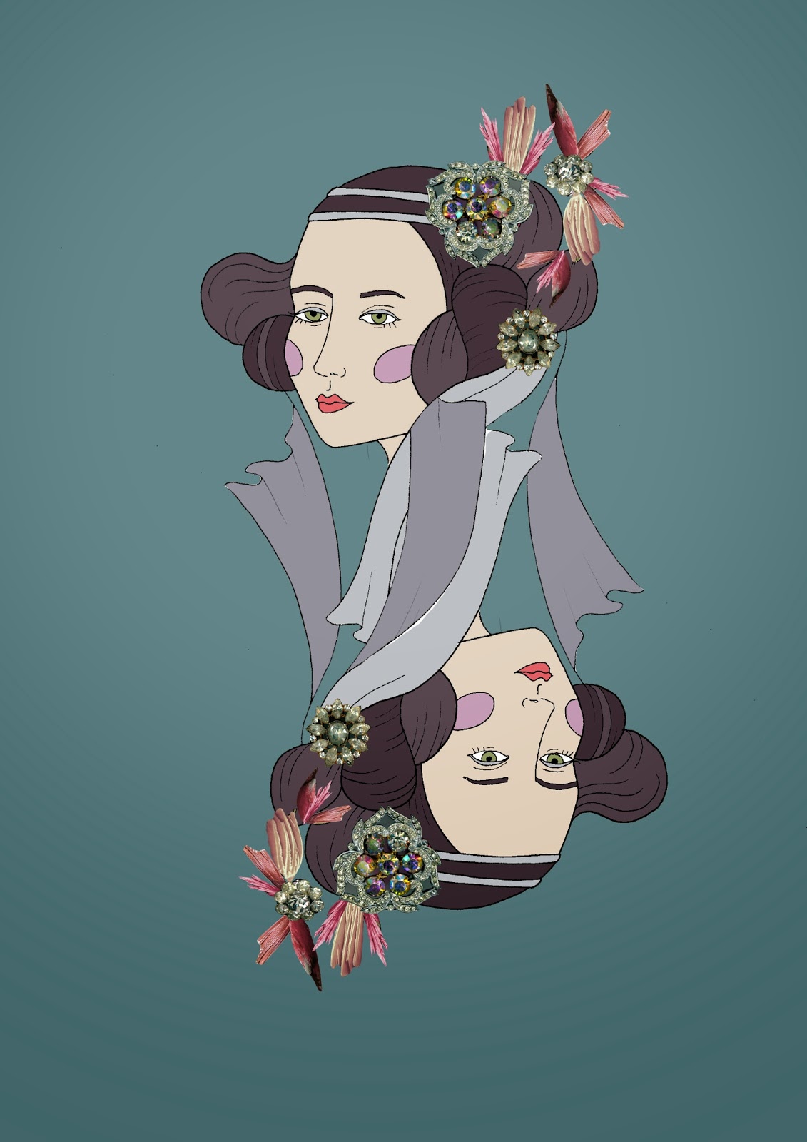
Today I was able to show everyone my first attempts at composition and they went down quite well. We discussed ways of laying out the heads, for instance putting them in a crowd, and ways of trying to push the idea further and really exploit the theme of extravagance and trying to be over the top. I think this is good as I realise that I can't use the playing card format again, I need to try and mix it up to vary the collection and make it look visually exciting. I know I've been getting carried away with the heads lately as it has been so fun, but I do want to try and get the birds back in there a bit more somehow, as they have been quite a big part of the development throughout the project. 

We also talked about my plans around the live brief side of the unit, as I have yet to do any work around this. I have decided to give myself a short time to complete the two briefs I have selected, and treat it like a mini-project, as realistically after uni I will have to learn to complete briefs quickly; and also I think it will make a good break from my current personal project. I subscribed to the Patternmash website set up by an ex-student, and had a really good chat with her about the project and how it works, so I am looking forward to playing with that and absorbing all the inspirational stuff she has been sending us. I also wanted to do a more commercial one, so I picked the Tiger print Everday Surface Pattern brief, as it will challenge me in a different way, and give me a chance to go back to pattern, as my work has been very much placement based lately. Both of these have the submission deadline, so it seems like a good idea to do them both together.

Sunday 26 January 2014

More heads

I'm really enjoying work with head and photo collage, so here are some of the better pieces. I really wanted to just play around with the medium and really push it, for instance making all her hair out of feathers (which annoyingly turned out to look quite subtle, especially considering how long it took to cut out all the feathers) and this jewel encrusted face. I think combining the two on the playing card style head was most effective, as it really reflects my theme with the use of era and opulence. 


I liked this motif so much in fact that it spurred me on to start doing final designs, placing the motif in repeat in a square shape. I am so pleased how they turned out, especially the one on the right which I think looks quite 60s-ish (not neccessarily what I was trying to get across but I love it any way). This has got me totally excited to design my collection, now just need to crack on with designing more motifs. 


Manchester Museum

It was suggested that I go to Manchester Museum to get more photos of stuffed birds, and therefore more resources to work from. Although it was interesting to see some different species of bird, the lighting at the museum made it difficult to get bright enough pictures to work with - I think that once cut out, some of these photos wont be crisp enough to be enlarged to a big enough scale. I did however find some great boxes of wings, perfect for transforming into collages to replicate my early work using the photos from books. I really liked these images below, particularly the stuffed heads (so macabre!) and the richness in the last two images - so many jewel-like colours to work with.


Thursday 23 January 2014

Context research

I have been looking at various scarf designers throughout the project, but I feel that this isn't really following through into my work at all - the two have remained quite separate. In the last project I had two big mood boards to refer to throughout the project which meant I was constantly reminded of my theme, so I decided to put together some context mood boards that I can refer to, especially now I am beginning to think about scarf layouts more. I did three all together: one each for Hermes and Liberty (my main inspiration) and one for other high end designers to give me a broader view.


Tuesday 21 January 2014

Tutorial

In this weeks tutorial we were mainly discussing how to start thinking about final designs. Alex suggested I start working within squares to help me think about layout, which I think is a good idea as I am so used to working in rectangular shapes. We also discussed considering doing colourways for my scarves - Hermes self their scarf designs in multiple colour ways, so it would definitely be a professional way to approach my work. alex suggested I could have a bright, cool and grey colourway for each design, so this is something I am going to start thinking about. 

Last week we had the colour for photoshop workshop which was incredibly useful and I found out so many shortcuts for doing things that previously had been taking me hours to do! I hope that these new skills will help to develop my photoshop work and make it look a lot more slick; especially things such as colouring in my work, as my method of solely using paintbrushes looks rather too childlike sometimes. I also found it really interesting finding out how to present designs for fashion, as it felt like another step towards making my work look more professional. 

We also had a workshop this week on using live trace in Illustrator. I did find this interesting, but I don't know how much I will end up using it - I'm so much more competent with photoshop that I don't really find myself flipping between the two programmes. I do realise however that it is really important to learn these things, as being able to use Illustrator will be useful in future jobs etc.

Monday 20 January 2014

Illustrators

I'm enjoying working in a line style again in this project (it does seem to be my favourite at the moment) so here are two illustrators who have helped inspire the female faces I have been drawing. Top is Laura Callaghan; I discovered her editorial work in Stella magazine, but then I soon realised she also did a lot of work for Oh Comely (perhaps my favourite magazine, great resource for artist research). I like the curvy, often lazy women in her work, and the expert use of bold colour. Below that is the work of Liselotte Watkins, I really like her almost continuous-line style, very free flowing and with a lot of movement. I really enjoy working in this style for drawing faces, as you can create really interesting shape, and then let block colour do all the rest of the work.


Wednesday 15 January 2014

Colour choice


I really liked the vibrant, yet slightly soft colours in these two collages, and as the birds were taken directly from the bird book that was inspiring my colour, it seems the best image to give an overall idea of the colours I liked. I have created two separate swatches, one for each collage, so that I can pick and choose which colours I use - ie. a bright one for bold images and a paler one for more subdued motifs. 

Tuesday 14 January 2014

Birds in fashion

Some bird related fashion inspiration.


Tim Walker always wins hands down in my opinion, I have always love his work, he has a wonderful sense of style and his photographs have this wonderful ability to make you smile. I've always liked the swan image of model Erin O'Connor (top left) but I recently discovered these images of Jennifer Laurence, which have such a lovely soft quality to them.


I love the dramatic sweep of the dress and the birds in this Norman Parkinson photograph, whilst I liked the bold shape and unconventional use of feathers in this image on the right. 


Lastly are these incredibly skilled paintings by Amy Judd. I like the collaged nature of the wings here, they are out of place and yet blend seamlessly with the face to create interesting shapes. 

I want to take all these artists into consideration in my own photoshoot, definitely lots of ideas to get me started.


Monday 13 January 2014

Tutorial

First tutorial of the term - Got some really positive feedback about my work in this session, particularly about the birds that were collaged together with the frilled skirts. I really like this mish mash and contrast of styles, and it was suggested that I perhaps push this even further to create really crazy surreal birds of my own invention. I was also told that I should try playing around with the backgrounds, perhaps historically styled interiors, upon which I can place my invented birds. I think the next step is to go to Manchester Museum to get more photos of birds, as although the initial collages were good for experimentation, I can only use my own material in my final motifs and designs.