Sunday, 28 April 2013

Venues


As Julie gave us a list of possible exhibition venues in the northern quarter, we split up the group and Niamh, Mariam and I went to have a reckie of the venues whilst everyone else covered the various lectures. It was interesting to see what spaces were available and was a good begining point to make us think about how our individual work could fit together as an exhibition. We really liked Nexus Art cafe as they had a really cool window space that we felt we could make a collaborative 3D piece in, along with plain walls that we could display individual work on. Our back up choice would be Terrace bar, which was moodily lit, had textural open brick walls and just generally had a really good vibe to it.


My notes from the walk

Art school

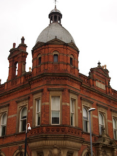
As we are supposed to be looking back at the art school anniversary, I decided I would look at the architecture of the art school buildings as inspiration for my drawings. So I went out looking specifically at interesting and detailed architectural details.


Developing themes

Everyone had been so busy with their own work that we hadn't had a meeting for quite a while. I think this is where facebook has its benefits, as we message each other daily on chat, but some of us were getting exasperated that we hadn't physically seen anyones work for a bit so we arranged a meeting, which was so beneficial for everybody. A few group members had been toa tutorial the day before where we informed that we had to bring the project back to celebrating the art school anniversary.

After pooling our ideas we decided that a good way to move on from culture was to look at culture in the city, and we divied up areas of Manchester for each person to explore, with a plan that everyone would have a week to research their area and create artwork before meeting up to see how this could be brought together as a collaboration.


Plan of everyones allocated areas
 

Friday, 26 April 2013

Print fair

Went to an amazing print fair at 2022NQ in the northern quarter. There was loads of interesting stalls and artworks, and it was buzzing with creative people. I found it really inspiring to see fresh new artworks and also how they applied their designs (zines were very popular) and there were so many interesting designers, makers and artists that I think what I picked up on most was the general style and limited colour palates. I had been wondering how to move my work forward, but it helped to clarify that I'm very happy with the current graphic style I'm using, so I think I'm just going to push it further.

Tuesday, 23 April 2013

Phillipe Petrament

Stumbled across this artist's work and I really like the way it collages together different banknotes to create one image. This fits in really well with my currency drawings as I was trying to combine different motifs and symbols from pennies and combining them as a single illustration.


Poster

Our first proper meeting after the holidays was at Hilton House where we had to create a poster to show how our project was getting on. It was interesting to see what everyone had been up to and created, and to get some positive feedback on my own work. We created a busy poster that brought together elements of everyones work from the previous two weeks.


Thursday, 18 April 2013

Northern Quarter Safari

Despite getting absolutely soaked as it decided to chuck it down as soon as we set off, I really enjoyed this tour of the northern quarter with fashion tutor Louise. It was amazing to find out all about the history of certain buildings and the area generally and it was interesting to have a good old wander around Ancoats - it made me realised how little of the Northern Quarter I have seen past Oldham and Thomas street. Below are photographs of some of the most interesting bits.


I've always followed the lomography website, so I loved seeing the Lomography wall. Covered in hundreds of film photographs, it just has this great presence due to the scale, and the images themselves have weathered really well.


I really liked these enormous panels showing interior photographs of delapidated cotton mills, an interesting play on what the northern quarter was originally built on.


I also liked the little quirks you could spot here and there, that you might just walk past unless someone stopped and pointed them out to you, such as the amazingly graphic gold sign of this boarded up pub and this lit up artwork set into the wall.

Also part of the tour was a trek up to Cheetham hill to visit a trimming wholesaler, which was textiles heaven! Could have bought so many things that I didn't actually need, but it will be an extremely useful resource for the future.


Light experimentation

I spotted sunlight shining through objects on my windowsill in an interesting way, so I thought I would see how it looked over my drawings. I like the weird effect and think because of it I might consider other ways to incorporate colour into my work, as solid colour can sometimes make eveything appear a bit flat.


Holiday work

Before the Easter break we had a group meeting to discuss where to go next, and decided that we would take this theme of currency and culture and see where it took us in our individual ways, and then after the holiday we would be able to bring our work together and discuss our direction.

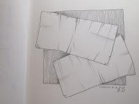
It was during one particular day whilst I was away from home with nothing to do that I decided to start drawing what I had on me, and this soon developed into a little sketchbook specifically for illustrations and drawings. My starting point was bank notes and looking at the close details that you never usually notice.


These were all details taken from a £5 note.


Here I started to look at foreign coins, and introduced a single bold colour.


I particularly like these two as they are simple but work rather effectively.


The Brewery

Whilst at home I decided I would look at some galleries to see how space is used in a small countryside town, compared to the enormous exhibition spaces available in the city. I visited the Brewery Art Centre in Kendal as saw an exhibition by local artists. It is an usual space as the dark beams cut across the room and the staircase takes up the entire centre of the room, but the white walls, skylights and use of spotlights means it still feels bright and airy.


I particularly liked this idea for displaying work - layering accetate images over boxes
containing miniature scenes.


Manchester Art Gallery

The Raquib Shaw exhibition at The Manchester Art Gallery however was much more sparse and really utilised the cavernous white rooms. Spotlights on the work give focus to the individual pieces, but I'm sure how much I like how spread out the work was - personally it felt a bit empty. I did like however the unusual use of frames, particularly these round ones; it gave some individuality to the work.


I also really liked this idea of bring plants inside, it really ties the architecture and nature together well.


Manchester Museum

As one of the fashion tutors suggested we think about how to display our work in the future, I decided to go to some different gallery spaces to get inspiration for how we could present our own work.

I liked the dark backdrops, clever use of lighting and glass cases used at Manchester Museum for presenting work. It leaves the old dusty feeling of museums behind and gives a more overall modern feel. 


Wednesday, 17 April 2013

Currency posters


Here are our posters on display at Hilton House. The central two we worked on collaboratively, collaging money, stitching fabric and layering photos. We were planning on layering it all as one poster but we agreed it was more effective as two. We then worked on three separate posters to represent our different specialisms, mine (as in the textiles one) being the one on the bottom right. We had a really positive response from the tutors and other Revolt/Play groups, but one tutor did suggest that next time we should think more about how we hang and present our work. 


Lauren Bowker

This was the most inspiring talk I have been to all year! I found it so interesting to see how much a student from our course managed to achieve in just a couple of years. What I think was most relevant was the diversity of her work, as her very science-based uni work and experimentation with thermochromatic dyes led to offers of work from PQ Dye, The Internet of Things, Airbus and clothing technology for the next Oylmpics, yet her masters degree in Printed Textiles at the Royal College of Art led eventually led to work with Prechoo and Kryberg, window displays for Wolf + Badger and an artist residency for Hendricks Gin. I couldn't believe how much of a prolific worker she was, but this really good balance she has between the work she loves, such as her own company PHNX, and more 'bread-and-butter' work such as prints for Marks and Spencer. The best thing I took from the lecture was the importance of going out and meeting people, making contacts.


And she has had here work worn by Kate Moss and photographed by Tim Walker, which is doubly impressive.

Thursday, 11 April 2013

Currency

After we decided to focus on currency, we had several meetings to get together and create our collaborative posters for the brief. I decided to focus on my own fact about the 175 different slang words, painting them in different styles to create a backdrop. I'm really pleased how well we have been getting on as a group, as we all seem to be on the same wavelength.

Wednesday, 10 April 2013

Hetain Patel lecture

I found that this lecture totally contrasted all the others that I have been to over the past week or so, as Hetain Patel's performance artwork was totally different to the more illustration and photography based work I have been studying. Whilst I thought that the live henna artwork and the piece 'To Dance Like Your Dad', where he copied the movements and words of his father as part of a film, were intriguing and challenged my ideas of performance art, overall I didn't really like his work. Although I understood the themes he was exploring, I don't really think this type of art inspires me and I personally find the theme of identity is one that is kind of overrated and over-explored.

Tuesday, 9 April 2013

Le Gun lecture

This was another lecture that  found quite interesting as it questioned my ideas of how an artist collaborative should work. I liked their laidback approach to work an how they just make the work they enjoy and therefore only takeonjobs they actually want to do, even if this isn't nessecarily financially viable. Starting as several artists/illustrators working together on their magazine 'Le Gun', they have branched out into gallery works, exhibitions with entire rooms made of cardboard, and stained glass windows. As a group they also set up a shop, which was used as the set for a Babyshambles music video. I like this mis-matched and random approach to work as much as I like their hand-drawn black and white style.   


Theme 175


After being sent away to find three facts linked to the theme, our group had a really productive meeting where we came up with a theme specific to our group. Above are my notes from the session. All my facts were quite random:

- there are 175 different slang words for money
- at one of the tube stations in London there are no escalators,
but lifts and a spiral staircase that has 175 steps 
- a report in the news said that a dementia patient was mising for a day
and turned up 175 miles away at a hospital with no recollection of how he got there.

Quite a few of us had found facts related to money, so we have decided to look at currency and from this we will be able to branch into culture (there are people from quite a few different cultures in our group). 


Dave Haslam

I found the lecture by Dave Haslam so interesting, and so inspiring in fact that I left the lecture buzzing to go out and be creative. He was discussing the differences in mainstream and marginal culture and the backlash that started in the 60s and 70s. I liked the way he described mainstream culture andhow we are all aware of the big shops/club nights/names but how do we find out about the 'cool' behind-the-scenes stuff? I think the reason the lectue was so interesting was not just the topic of discussion, but the way he used examples local to the area we are currently living in - how Joy Division started off in a pub in Salford, and then went on to create te Hacienda, Everything Everything started off in Night and Day Cafe, The Chemical Brothers started off their own clubnight; all marginal origins that became massive bands and names. 

I liked this idea that everything is a cycle, marginal activity is new and pioneering, more people are going back to independant shops, making their own clothes, getting involved  in subculture, and yet everything that is marginal will one day become mainstream as more people find out about it and it becomes popular, and so the cycle starts again. Alongside secret clubnights and upcoming bands, I found the idea of fanzines really interesting, and Linder Sterling's work on 'City Fun' sounded such a clever way to get your ideas out into the world.


The quote that stuck with me the most was that 'cities are a breeding ground' for ideas and culture, and after finding out so much about the reccent cultural history of Manchester I really aprecciate living in such an interesting place.