Showing posts with label L6 Practice Unit. Show all posts

Sunday, 8 February 2015

Evaluation

I have learnt a lot about my own practice in this project that I think has helped me to develop my work: I've tried experimenting in different ways with plenty of new techniques to push my motif making and design style to the next level. Working on such a long project has been a struggle at times as it is very easy to become uninspired when looking at the same imagery all the time, but looking back on all the work I have done it feels amazing to see that my project has come so far and I have managed to include so many things. At times managing time has been quite fluid as we had so many months, but I think I have learnt that it is good to have a structure in place even if that is tweaked and changed throughout the project. The learning agreement has been useful for this as I have been able to adapt it to add in extra collections, and slightly change the theme which has given my work the chance to grow organically. In the beginning I was planning to focus on 'heritage', a loosely picked term, but this project has evolved into looking at all aspects of collecting and in turn become a fully fledged concept. 

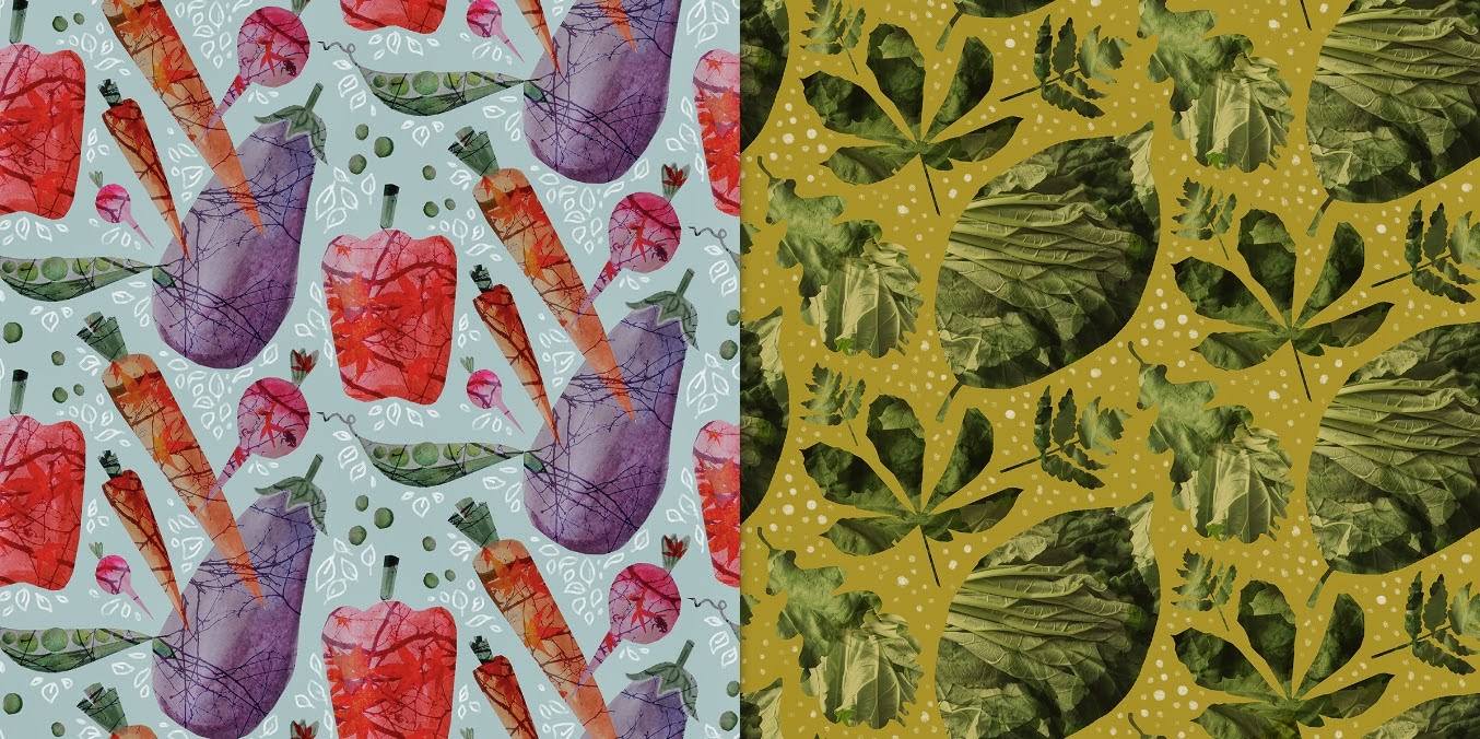
One aspect that I think I have really achieved on is my networking and attempts to develop my work outside of uni. I have found doing the monthly projects on Patternmash a great way to break up the project, and has led me to discover that I could work well under the pressure of a job with quick turnaround, such as freelance. Repeatedly working as something has done me well as it was thanks to doing the projects every month that got me spotted for the sites Designer Spotlight, a really positive addition to my CV. I have also reaped the benefits of just pushing through with my work, as I didn't enjoy doing the vegetable prints for the Lacuna Press competition, and yet through persevering I won.


I am really pleased with the state of my three collections, as I worked really hard on the concept which is not something I have ever developed quite as much as this. I like how the three look at different aspects and yet link together: 'Curious Antiquities' covers old antique and unusual objects, 'The Mapie's Hoard' looks at people who obsessively collect one type of thing, and 'Flotsam of Life' reflects on the sort of collections of detritus that gather on their own. I am looking forward to pushing each of these collections further in Unit X and developing new designs to go with the final ones I have already created. I plan to really push the lookbook idea as I think the practice imagery was really successful, and I also want to develop a brand that has a life expectancy outside of uni. 

Tableware designs


I have thoroughly enjoyed doing the styling for my tableware collection as photography is something I never really get the time to do. I just did the mock ups with white plates so I can displace my designs on at a later date.


As I have chosen to look at different types of collecting as inspiration for each design collection, I decided to push my concept further and look at the collections that seem to grow all on their own - all the worthless bits of matter that people seem to collect but don't want to throw away. I used photographs of objects I found in jars at home, and used just the objects from one jar or drawer in each print. I really like the soft effect of multiplying the layers of photos. These are just mock up designs as I have not the chance to thoroughly develop this collection yet, but I hope to use these as a starting point in the next project. 

Visualisations


Earlier on in the project I tried to do line drawn visualisations alongside digitally collaged ones, but neither gave quite the effect I was looking for. Going back to the drawing board and really looking at my customer profile and shop report research was so helpful, as I suddenly realised the look I wanted to achieve. I think these visualisations were so much more successful because I actually really thought about the outcome and the image I want to project to the customer. I also drew some simple flats to show off the prints more easily on my final moodboards. 

Tableware


So far in the project I have just been working on prints for a fashion context, but the more I work with my motifs I realised they would work really successfully in a homeware context. I'm excited about the prospect of creating a tableware collection, which could cover crockery, tins, napkins and other kitchen ephemera, as it will give me a chance to develop my surface pattern skills. I have done plenty of research this week into companies which digitally print onto various objects, which has got me very excited about the endless possibilities. I also think it would be the perfect opportunity to do some styling and photography, so I have started to bring together some inspirational imagery from the likes of Toast and Country Living.

Scarves


I decided to lay out my motifs as scenes for the scarf designs, which I think is really effective as it puts all the objects into perspective. The simple shape of the scarf gives the perfect canvas for a non-conventional print, as it becomes an abstract print once folded and knotted around the neck. I'm also really pleased with the shadows and sense of perspective as I have been looking at trompe l'oeil paintings for inspiration - the shadows mixed with photographic and digitally drawn imagery works really successfully. 

Repetitive collections


Even though I have the over arching concept of collecting, I want to really delve into my concept when defining my design collections. The work was already separating into two elements visually, with womenswear being more flat, collaged pieces, and fashion accessories focusing on 3D drawings and perspectives. I feel I haven't properly looked at the obsessive side of collections, so I have chosen to focus my womenswear designs on people who collect lots of one thing, whilst the accessories prints gather together all of the antiques and collectables. I have thought about pushing the concept further by looking into names of different types of collectors, and naming each print thus (such as the 'lepidopterist' for the moth print above).


Customer

Now that I have revised my collections, I decided it would be a good idea to have another look at who I am actually designing for, so that I can have them in mind throughout the design process. Whilst both customers are fashionable young women I saw them with slight differences - the womenswear customer would be chic and elegant, choosing simplistic and classic items, whilst the accessories customer would be more quirky, vintage inspired, and open to buying something a bit more unusual. Now that I have a more clear idea of my customer I feel I can visualise them whilst I'm designing.

Thursday, 15 January 2015

Live projects

Entering online print competitions has given me a good break from the monotony of working on my main project lately. I thoroughly enjoyed both the Front Row Society and Textile Federation projects as they were inspiring themes that came with a wealth of imagery. I found it useful practicing print-making with photographic elements as I have mainly been working on drawings in my project. As fun as it has been having a break from my usual work, it has also given me a chance to practice other styles of working, and to remind myself of where I see myself after university. 


Even though I hated doing the prints for the Lacuna Press competition, as I mentioned in a previous post, I actually won the competition and was asked if I could have my designs listed on the designed fabric section of their website. This is really exciting as not only is it the first proper step towards my design career, but it also shows that it is worth entering every competition even if it is not particularly enjoyable at the time.


Reflecting

When I went round town for the shop report I realised that I didn't feel very inspired by the shapes I was seeing, and and it made me rethink my idea of just doing womenswear collections for high end and high street. I really want to use this project to create something different and exciting, alongside being able to show that I can do commercial design. I know that I want to do scarf designs again as that has been successful in the past, but I also want to branch out, so I have decided to widen this into fashion accessories, but I will also stick with doing one high end womenswear collection for variety. After quite some thought I realised that handbag linings will be the perfect vehicle for my busier prints, as I can create something quite simplistic on the outside that reveals a wealth of treasure once you open it. 

Womenswear research


Handbag research

The things that I found most interesting when researching clothing shapes was the use of panelling and contrasting textures - lots of sheer sections in unexpected places. There was also lots of unusual hemlines that were longer at the front or back. I think it is these subtle details that rather than an in-your-face print that makes something high end stand out, so I will make sure to incorporate some of these elements in my designs. 

When it came to handbag research however I was even more uninspired by what is on the market, which seems to be flooded with basic tote shapes and boxy designs, excluding the odd unusual shaping from Alexander McQueen and Stella McCartney. I chose instead to focus on vintage handbag shapes, which lead me to look at some really interesting history books where I discovered lots of interesting things about the origins of handbag shapes which will feed back into my design work. As I am planning on designing a simple exterior to contrast my busy linings, I think I will need to try sourcing some leathers and suedes to experiment with. 


Visualisations


Left: plaster head (own image), Right: own drawing.

I have been mulling over how best to display my work in context other than just the usual standard flat illustration, as I want to differentiate myself from all the other print designers on the market. I was inspired by my digitally drawn Staffordshire dog to try recreating a mannequin head to display my scarves on, as I could then place the head among other items on a shelf to create a feedback loop within my designs. I was super pleased with the final result, partly as it looks so similar but mostly because I think it is a quirky and unusual way to show off my designs - something that will make people stop and look at my work wondering if it is real or not. 


Left: La Casita de Wendy, Right: own drawing.

I've chosen a more conventional route for my womenswear designs as I want to show that I have many qualities as an illustrator. I really liked the unexpected splash of watercolour in La Casita de Wendy's lookbook, so I tried to recreate a more toned down version with my own graphicly simple drawings. Although I like the concept, I think my designs don't stand out enough so I think these will need more development.

3D

I have been thinking for a while for the most interesting way to display my motifs within prints, as I don't want to get stuck in boring repetitive styles, so I have found looking at non-textiles artists a really good way to come up with innovative ideas. 


Left: Joseph Cornell, Right: own design.

It has been mentioned a few times about adding shadows and authentic labelling onto my designs to help make my 3D tablet drawings stand out, so I looked at Joseph Cornell's Shadow Boxes as he combines different objects in a collector's format. I found this helped influence the print above as it helped me get my head around where to place shadows to introduce perspective in my work.


Left: image from book, 'How to Wrap Five Eggs', Right: own design.

In some prints I want to use traditional looking formats to show motifs, such as shelves and cabinets, but I also wanted some more interesting ways to show my work. I was recommended to look at 'How To Wrap Five Eggs', a book on Chinese wrapping, which gave me plenty of different ideas for showing objects together, and led to this macrame inspired print above. Looking at unusual inspiration has helped me to look at my motifs in a non-traditional way, which in turn has inspired me to create much more varied work. 

Live Projects


The Lacuna Press 'Vegetables and Trees' competition and the Patternmash 'Prints of Persia' project are two examples of live projects I have been working on in the past few weeks where I really didn't enjoy creating the designs. I found the veg one a real challenge as it wasn't a theme I would ever pick, but it was good to push myself to prove that I can create good prints even when its hard to engage. I think it also shows my versatility as a designer as I have proved I can work to challenging deadlines.


'Prints of Persia' was difficult in a different sense, as I really thought I'd enjoy this theme but I struggled to make the motifs look how I had imagined them. I feel pushing through on these sort of short live projects has taught me a good lesson in perseverance, as I was even prouder of eventual prints I created as I had gone through such a struggle to get to that final point. I really appreciate the importance of live projects as with each one I am getting more confident with my style and use of techniques.

Review week


Preparing for review week has given me a really good chance to reflect on what I have done so far and made me realise that I have achieved much more than I thought I had. I had been feeling like my project was a bit all over the place as I have been using so many techniques, but grouping images helped me to see where clear collections are coming together. Being able to succinctly describe my work to a group of people who haven't seen it before was also useful as it made me concentrate on what is most important.


I decided to put together some visualisations to display my work in context for the purpose of the presentation, but I don't think they were overly successful as they just look a bit childish and don't really reflect my concept. I plan to do more research into different styles of illustrations so that I can create something that fits better with my work. 

Wednesday, 3 December 2014

Large scale

I mentioned in a previous post that I wanted to try working on a larger scale to loosen up my drawing style, so this week I bought a roll of wallpaper and some tester pots, and spread myself out on the studio floor. I carried on with the theme of repetition I have been playing with recently to force myself to paint the same thing over and over, which was very freeing as it made me focus on the medium rather that being precious about the visual. I think I will try to work on a large scale more frequently as I like that although the images look messy, once they are scaled down and put into prints they will retain their interesting texture and details. 


I used the leftover paint to create coloured sheets to collage with, in the style of Mark Hearld. I find I often limit myself to working with just watercolour paints as they are always to hand, but I have enjoyed trying out other paint techniques as I have discovered a different way to incorporate texture into my work, which will bring some much needed life into my otherwise often flat, boring imagery. 


Left: Mark Hearld collage, Right: own collage

Repetitive photography


As part of my attempt to push my use of techniques, I decided to play around with photographing objects in different patterns. I have found physically playing with elements has been a good way to think about my print layouts in a more inventive way. I also think I have been limiting myself to just old objects, whereas collections of mundane objects are just as intriguing, and may be a good way to bring a different angle to my work in the future. 

Narrative


Left: drawing, Right: Plate from Preston Museum

Narrative is something that has been mentioned a lot in my tutorials but I have really been struggling to work out how to incorporate story telling into my designs. I was inspired by some antique plates to tell a story through portraits combined with images, so I drew a few of my friends and their belongings in the style of the plates I was inspired by. I think these were successful as they give you an insight into the person in the centre of the image, but the limited colours prevents it from looking too confusingly busy. 


Left: Plate from Bowes Museum, Right: plate design.


Organising by type


In the project so far I have just been drawing which ever objects take my fancy, but I wanted to try picking motifs specifically for a print, rather than just hoping that they would go together as an after thought. I carried on my watercolour/collage technique here to give myself a limited colour palette, and found organising objects by type (such as animals) a good way to create a coherent set of objects, which gelled together well when I dropped them into a practice print layout. 

Thursday, 30 October 2014

Patternmash Designer Spotlight

Over the past few months I have been working on creating prints for Patternmash, which has really helped me to practice working quickly and efficiently to create prints for different briefs, and expanded my repeat print skills. The challenge of creating prints for themes I wouldn't have chosen has pushed me to experiment with my work and given me the confidence to design on a quick turnaround, even though I do not necessarily always personally like what I have produced.

I was recently picked for the site's Designer Spotlight feature, and the process of being interviewed led me to reflect retrospectively on my work, helping me to see how my body of work as a designer is viewed by the outside world. This has fed back into my practice as I have learnt the importance of stepping back and seeing how my project works as a whole. 


Tuesday, 14 October 2014

Collections

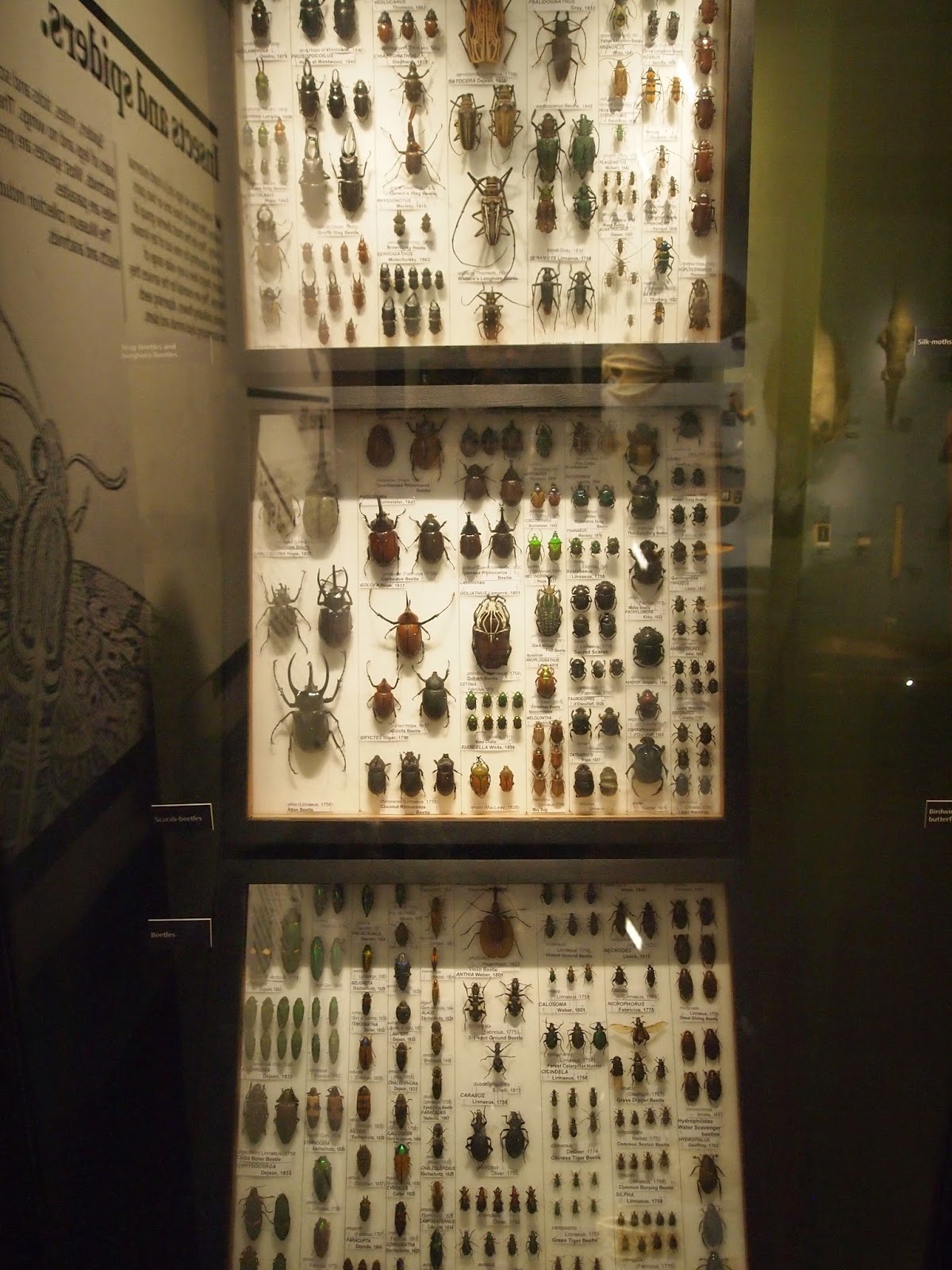
As I have been visiting different museums to collect imagery for my 'heritage' theme, I have come to realise that it is not necessarily the objects themselves that I am usually interested in, but the way they have been displayed. The pattern-maker side of me has been drawn to the way objects are laid out - I found it interesting to see how objects are displayed in a museum as opposed to how the exact same items would be displayed in a personal collection. After conversations in tutorials I have decided that I want my theme to focus on the 'collecting' side rather than just objects of age, as I think this will give me more of an interesting concept.


Manchester Museum (own image)

Now that I have chosen to focus on collections, I thought it was important to start putting motifs together to see how they look collectively. I was inspired by Sarah Cwynar's photography to order objects by colour, and although I like how the different shades of one colour reflect off each other, I think I need to find a way to make my work look less flat, as I feel it currently looks very uninspiring and expected.


Left: Sarah Cywnar, Right: (design work)

Sunday, 12 October 2014

Techniques


One of the things I wanted to tackle first from my learning agreement was making myself be more experimental with my techniques, as I often get stuck in a rut of fineliner pen, watercolours and drawing on a small scale. As I really got into collaging over the summer, I decided to combine this technique with one of my old favourites, using sheets of watercolour painted paper and stitch to create a textured image. I also tried to work slightly bigger than usual (this piece is around A3) which I found very freeing as I could be looser - I really want to push this further in the project and do more with scale. 


I received a graphics tablet over the summer, and using this to draw straight onto my laptop has totally changed the way I work. I decided to push my new found technique to try and draw something hyper-realistic, copying museum items and also making my own objects from images of real animals (such as the horses above) which I think worked especially well in my depiction of this Staffordshire ceramic dog, as the soft brushes give a very realistic glaze effect.