Showing posts with label Unit X - Make and Manufacture. Show all posts

Wednesday, 14 May 2014

Exhibition prep

Now that my collection has been finalised, this week has just been all about getting ready for the exhibition. I decided to pick just two to print, choosing one dark and one pale so as to reflect both sides of the collection. I did have to over come a few problems however, as I had to make my prints smaller as the new roll of cotton voile fabric that came in was smaller than usual. So my digital fabric prints are now around 140cm x 50cm, which is obviously is a scaled down version of what I had designed them to be but still displays how my prints would look as an end product.


After Sally suggested I continue the branding I started looking into in the last project, I decided to mock  up a box to help show how the scarves would be sold. Below is the lid I designed, based on elements of the scarves, and designed to show off the baroque element of the project. 


Visualisations


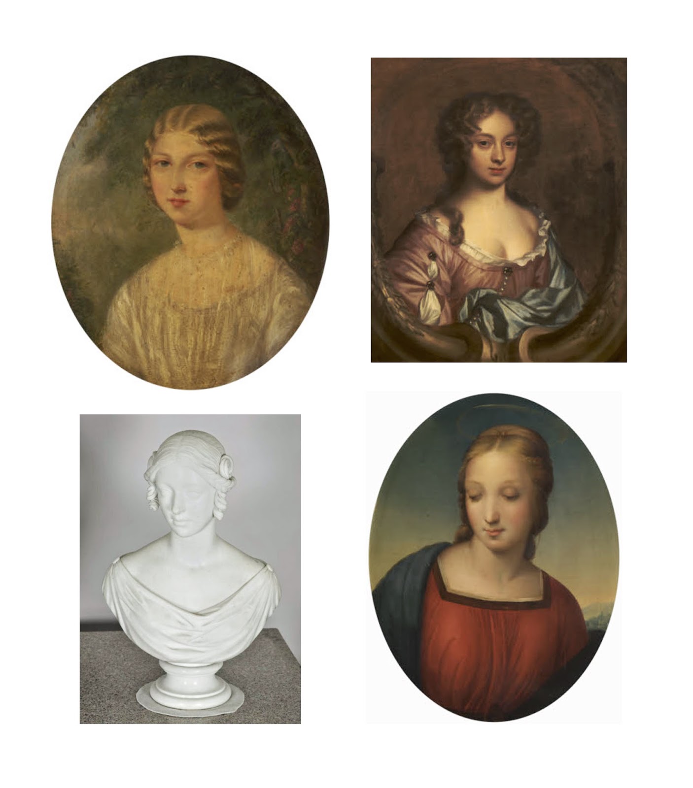
I knew that I needed to show my scarves as visualisations to show what they would look like as a final product, but it took me rather a while to decide what medium would be appropriate for the project. I didn't want to just put them on simple photographs, I really wanted the visualisations to be as interesting as the scarves themselves, without overpowering the prints. I was so pleased when I hit upon the idea of doing illustrations of women from Taton Park, using portrait paintings and sculptures from the National Trust archives as a basis for my stylised drawings. I think it is a perfect way to tie together the project, and would be a great way for each individual Trust shop to display these scarves, as they could use portraits based on the historic people from the site. I also think the combination of using Photoshop displace on a photo of fabric against the illustration worked well, as it ensures that the scarf is what stands out. 

Thursday, 8 May 2014

Final Designs


These are the final 8 designs for the scarf collection. I decided to choose 4 blue/green designs and 4 pink/purple designs to have a nice balance of contrast in the collection. I'm really pleased with the final outcome as I think it perfectly fits everything I was hoping to achieve - a baroque feel inspired by and using elements from the National Trust Archives and Taton Park, traditional enough to appeal to current customers, but with a modern twist that would bring in younger customers too. As the scarves are designed to be produced at a 180cm x 70cm size, it can be hard to see the detail in the images about, so below are some close ups of the prints to show some of the detailed motifs used. 


Tuesday, 6 May 2014

Digital print experiments


So I began to have a play around with the baroque frame motifs I had made, and as pretty as they are, they felt a little flat and I simply just don't like them. As I don't use brushes very often I've been finding it tricky to make them do what I am visualising in my head, so I tried to play around with them a bit more, add a few more layers and a better mix of colours. 

Above is a selection of prints I made using the changes I previously mentioned, and I think this more varied approach has been very effective. I like how the prints use a lot of bright colours yet the combination and ratios they are not overpowering or lurid, which I think would appeal to current National Trust customers, yet also target a younger market. I want to push these designs further so that I have an interesting mix to choose my final collection from.


Thursday, 1 May 2014

Colour swatch


Finally decided on a colour swatch for my prints. I'm pleased with the final selection as it gives me a variety of feminine warm colours, with a mix of soft pales with some brash brights for contrast. The above images were my initial inspiration, but I was worried that they might create to broad a colour stripe. I selected the warm, rich tones of brown, gold, red and soft green from the library interior, the cool pale blue and pink shades from the plaster-work in the ceiling, and the bright colours of foliage and flowers from the greenhouses, giving me rich green and hot pink. I didn't want to stick to just my photos from Taton, so I collected the images show with my stripe to try and reflect what I want to show through my prints.

Wednesday, 30 April 2014

Scarf research


I have started to think about making prints, but all attempts at Photoshop so far haven't ended very well. Now I have decided that I am sticking with scarves again this project, I decided to needed to get some inspiration for long scarf styles, to see what the National Trust already sell in their shops and what styles, colours and patterns are currently on trend in the womenswear market. 

Generally I found that most National Trust scarves varied between £15 - £35, but most were quite simple designs, with at most only a handful of colours. I think it would be nice for National Trust customers to have some more choice and variety, so I have decided I want to create a more heavily patterned scarf that fills a gap in their stock. I looked at scarves from a similar price range, in this case comparing with Accessorize, and found that they championed soft colours and predominantly floral details. For image and pattern inspiration I looked at more high end brands, and found that the more expensive a scarf was, the more likely it was digitally printed and content heavy. I particularly like Athena Procopiou's collection - even though they are square scarves, I would like to try this busy layered style in a long scarf shape.

Monday, 28 April 2014

Baroque motifs


Finally started to make some baroque frames using my motifs. I really like the overall effect but I'm not sure if they look a bit too solid and harsh - I'm finding it hard to adjust to this flat graphic style as it is something I am not used to. Hopefully once I start using colour they will begin to look a bit softer and more feminine, as I feel the rectangle ones in particular look a bit hard and masculine, not particularly suitable to prints for womenswear.

I am however very pleased with the frame below, perhaps because the motifs themselves already had quite a baroque feel to them. Can't wait to create a print with it, as I think it will be really nice to have a pretty baroque style print, that when you look closer you realise it is actually made up of jelly moulds, carpet beaters and sewing machines.


Saturday, 26 April 2014

Drawings and motifs


Over the Easter holidays I have been purely concentrating on making motifs for my prints. I have been thinking a lot about this idea of doing my own take baroque patterns, so I decided to build up a stock of drawings so that when I get back after easter I can start putting them together and making collages. I decided to focus on the miscellaneous objects I found on the National Trust website, collecting together a big folder of all the ones I found most intriguing. I tried to choose a variety of items, things with a baroque feel such as the carpet beater, the cut-glass bottle and the floral toy sewing machines, and other things that are more ambiguous to intrigue the viewer, such as the slightly squashed lantern, the straw animal and the unusual lampshades. 

I began drawing with my usual detailed pen and pencil style, but I didn't feel there was anything exciting or new about it. So I decided to take a more graphic approach (shown in the collage above), using only black pen and gouache, and trying to draw as if I was creating a paper cut, in the hope that when I begin to collage with them they will look more like lace than the shaded pencil style drawings. 

Sunday, 20 April 2014

Patternmash submission


The most reccent Patternmash theme was 'Facade', which I thought perfectly tied into my current Unit X project. I decided to use scans of my paper cuts to create brushes and elements of my photographs from Taton Park to add a 3D element to my Photoshop collage. I think this would be a great starting point for my print design as I had some really good feedback on these prints after they were featured on the Patternmash site. 

http://www.patternmash.co.uk/post/82989367031/lucy-smith-is-a-textiles-in-practice-student-at

Monday, 14 April 2014

Collaborative drawing workshop


After the 'speed dating' event where we pitched ourselves to the other group members to see if we wanted to collaborate, there was a few people who all said it would be really beneficial to our work to do a collaborative drawing workshop. We all brought along objects or images to draw from, and pitched in with different exercises to challenge our drawing styles. This was a great way to get to know some of the girls from 3D designs and learn from them how they like to approach the drawing stages of their projects. 

Below is the piece I ended up with, filled with several drawings based on the baroque elements from Taton. We played around with long and short drawing times, such as quick 1 minute ones varied with longer 5 minute ones. It was nice to feel encouraged to use different mediums and drawing styles, as I think it is easy to get stuck into a rut and to always start the project in the same way. I actually really liked the drawings where I had to draw with my eyes closed as I drew in a more organic flowing style rather than trying to be completely perfect and rubbing things out and reworking them. I now feel I have a really good starting point with my drawing and feel really inspired to go and get stuck in with my project.


Thursday, 27 March 2014

Experiments

In this project I wanted to push myself out of my usual working style, and begin the project by experimenting with other ways of 'drawing' and making images, other than using my favoured pen and pencil, which turned out rather well.


Wire work - I really want to try using the idea of using wire as a continuous line drawing, which was rather fun. I saw this technique of using nail varnish to look like enamel on an online tutorial, which I think works so well. It was really difficult to do as you have to stretch the varnish over the gap to create a bubble, so I quickly learnt that it was easier to do on a small scale. Above was the most successful piece, a simplified version of some of the baroque frames I saw at Taton Park. I like how using wire over pen as a continuous line means that you can actually create a 3D object, curving the objects to reflect what I was inspired by in the architecture at Taton.


Paper cuts - Here I took some of the details from my moodboards and brought them together in this spontaneous collage-style papercut, bringing in elements where I felt they fitted best. This was such a good way of freeing myself up, as even though you have to be neat, you some times just have to go with the flow of the knife - unlike drawing, you can't rub something out if it goes wrong so you just have to work with the line you create. As painfully slow as it was to do, I was really pleased with the amount of fine detail I managed to get into it. It was also really nice when I showed it to people in the group and they thought it had been laser cut - the time I took to do it clearly payed off!

Tuesday, 25 March 2014

Paper cuts


Looking at the lace on the archives made me think of papercuts, so I decided to do some artist research to further inspire me and to help me think of more modern and graphic ways to use this technique. As much as I love the work of Rob Ryan, I thought it would be good to look further afield and discover some artists I had never heard of before.

Elsa Mora is a multimedia artist from Los Angeles, who also does painting and illustration alongside these incredible paper cuts. I like the pretty, fairytale feel to her artwork, she almost seems to weave a story into her imagery. What really impressed me was the way she curls and shapes paper to create 3D pieces, a change from the usual flat paper cuts. The use of two contrasting colours is also really effective in making her work stand out.


I saw some of Andy Singleton's work at Manchester Art Gallery last year, and aside from his amazing use of scale (he often does enormous artworks that are several metres high or wide) I like the way that his pieces look like abstract patterns at first, and then when you look closer you realise that it is actually an image, such as his view of the London skyline above. I hope to incorporate some of his patient attention to detail in my own paper cuts.

Monday, 24 March 2014

Misc. objects


After trawling through the extensive archives on the National Trust's website, I discovered a section called 'Household/miscellaneous objects' that was full of a bizarre mix of items. I really like the fact that among all the items you would expect to see recorded, such as sculptures and paintings, there was these often seemingly worthless objects, such as blotting paper, envelopes, buttons and other household objects. Above are some of the things I found particularly interesting, such as the object on the top right that was simply titled 'straw animal' (I am most intrigued to know what sort of animal it is supposed to be!). I like the fact that the National Trust see an importance in recording these items of little worth, as it gives an interesting insight to the people who lived at these stately homes. I would really like to find a way of presenting some of these objects within my work and showing them off in a grand way as if they were just as special as some of the Trust's more prized and priceless items. 

Moodboards


I thoroughly enjoyed the trip to Taton Park, in particular visiting the house itself. I took a lot of photos throughout the day, but I decided to reduce the most inspiring ones into a selection of moodboards to give myself something to instantly refer to during my project. The first of two things that inspired me the most was the baroque interiors, which I have managed to reduce down into just the specific details (see middle image). What I like the most about these gilt frames and suchlike, is the creative combination of swirls, scrolls and flowers. They are often based on nature and organic shapes, but I think I might be interested on doing a different take on this, and perhaps incorporating my own motifs? The second thing I liked was the architectural details (see last image), from plaster ceiling roses to iron work on gates in the grounds. I like the way 3 dimensional form in itself creates shadows and line, making its own interesting patterns.

As baroque seemed to be the thing coming through during my visit, I went through the National Trust archives looking for anything under 'baroque', which brought up a lot of lace and other extravagant gold details. The way the lace has been photographed on dark background felt very graphic, and made me think of paper cuts, this may be a technique worth playing with in this project.