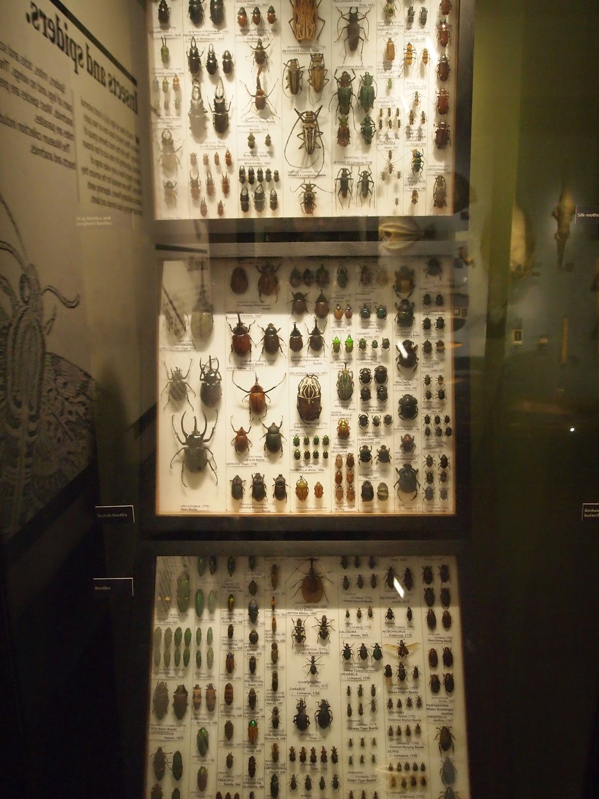
As I have been visiting different museums to collect imagery for my 'heritage' theme, I have come to realise that it is not necessarily the objects themselves that I am usually interested in, but the way they have been displayed. The pattern-maker side of me has been drawn to the way objects are laid out - I found it interesting to see how objects are displayed in a museum as opposed to how the exact same items would be displayed in a personal collection. After conversations in tutorials I have decided that I want my theme to focus on the 'collecting' side rather than just objects of age, as I think this will give me more of an interesting concept.
Manchester Museum (own image)
Now that I have chosen to focus on collections, I thought it was important to start putting motifs together to see how they look collectively. I was inspired by Sarah Cwynar's photography to order objects by colour, and although I like how the different shades of one colour reflect off each other, I think I need to find a way to make my work look less flat, as I feel it currently looks very uninspiring and expected.
Left: Sarah Cywnar, Right: (design work)


No comments:
Post a Comment