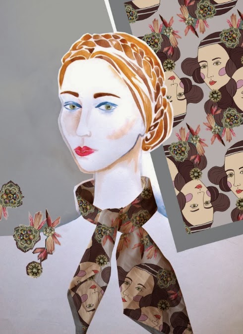
I was thinking of ways I could illustrate my work and thought of the idea of displacing my prints onto a fabric scarf and then placing it onto an illustration of a head, to make it tie in better with my project but to also utilise the displace skills we learnt in the workshop. I based my illustration on those renaissance style photo shoots to help tie everything together. I was so pleased with how well it turned out as the illustrative face really makes it tie in with my project, and is just a slightly different approach to visualisations. As the scarf looks so different when draped, I decided to display a section of the print next to the drawing to give the viewer an overall view of the final product. Placing my work into visualisations has also really helped how I design the scarves, as it has confirmed the importance of filling the corners, and is an easy way to see which designs work well - it is all well and good my designs looking nice flat, but they also have to work well when worn.


No comments:
Post a Comment