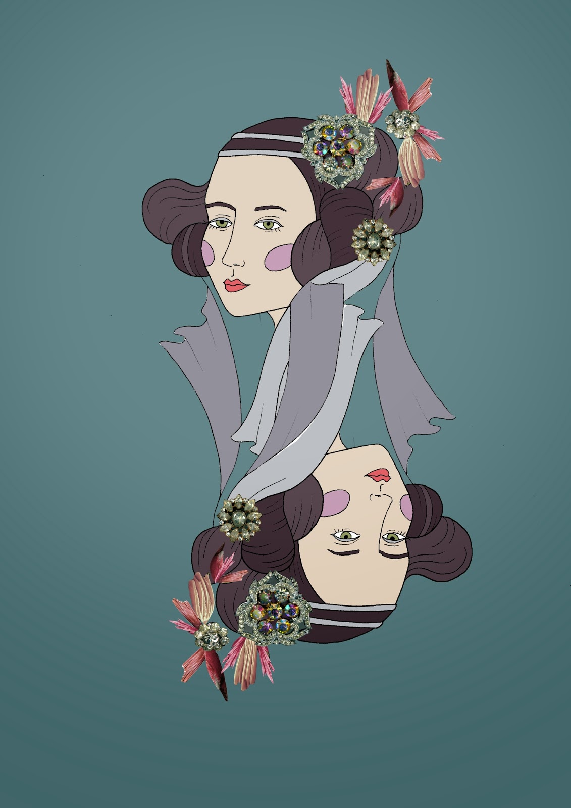
I'm really enjoying work with head and photo collage, so here are some of the better pieces. I really wanted to just play around with the medium and really push it, for instance making all her hair out of feathers (which annoyingly turned out to look quite subtle, especially considering how long it took to cut out all the feathers) and this jewel encrusted face. I think combining the two on the playing card style head was most effective, as it really reflects my theme with the use of era and opulence.
I liked this motif so much in fact that it spurred me on to start doing final designs, placing the motif in repeat in a square shape. I am so pleased how they turned out, especially the one on the right which I think looks quite 60s-ish (not neccessarily what I was trying to get across but I love it any way). This has got me totally excited to design my collection, now just need to crack on with designing more motifs.


No comments:
Post a Comment