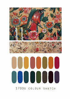
I think it was finally time I stopped thinking about my drawings and actually started bringing more colour into my work. I wanted to use authentic colours that would evoke the two eras I have been studying, so I've decided to take my colours straight from my moodboards, as these both contain images that I have selected, so its almost like my personal selection of colour from each time period. The only problem was that obviously each one had rather too many colours for me to work with, and I needed a slightly more refined palette, so I selected all the colours from both and decided which gave me a broad representation.
The final two swatches (I chose to keep them separate so that I can do some 18th c prints, some 50s prints and some with a mix of both colours). The thing that struck me about two periods is that they are both rather bright; I think you expect it of the 50s but not necessarily the 1700s.


No comments:
Post a Comment