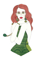
The 'Toast' catalogue was my starting point for deciding who my customer was, as I really wanted to do a Toast style outdoorsy photoshoot.
I decided that woman I am design for is the typical reader of 'Oh Comely' magazine - late teens to early thirties, sees themselves as an individual, likes quirky objects, unsual clothing, beautiful laidback styling and film photography. Here are some 'Oh Comely' layout examples - I love the stark simple layout.
Whilst finding my typical customer, I decided to bring together some styling and illustration that will inspire me. I absolutely adore the styling of these Goldfrapp album cover, and would love to reflect something similar in my own work.
Above is the work of 'Igor and Andre', whose handwriting I love, and below are some examples of Laura Callaghan, whose graphic style is really appealing.


No comments:
Post a Comment