Friday, 25 October 2013

Downing Collection

It was wonderful being able to look at a selection of pieces from the Downing Collection, part of the university's Special Collections, as it gave me the chance to see real fabrics from the period up close. I loved the enormous fabric book with prints from the late 1700s to the 1800s, as every single design was re-printed various times in different colourways and combinations, an amazing visual en mass. 


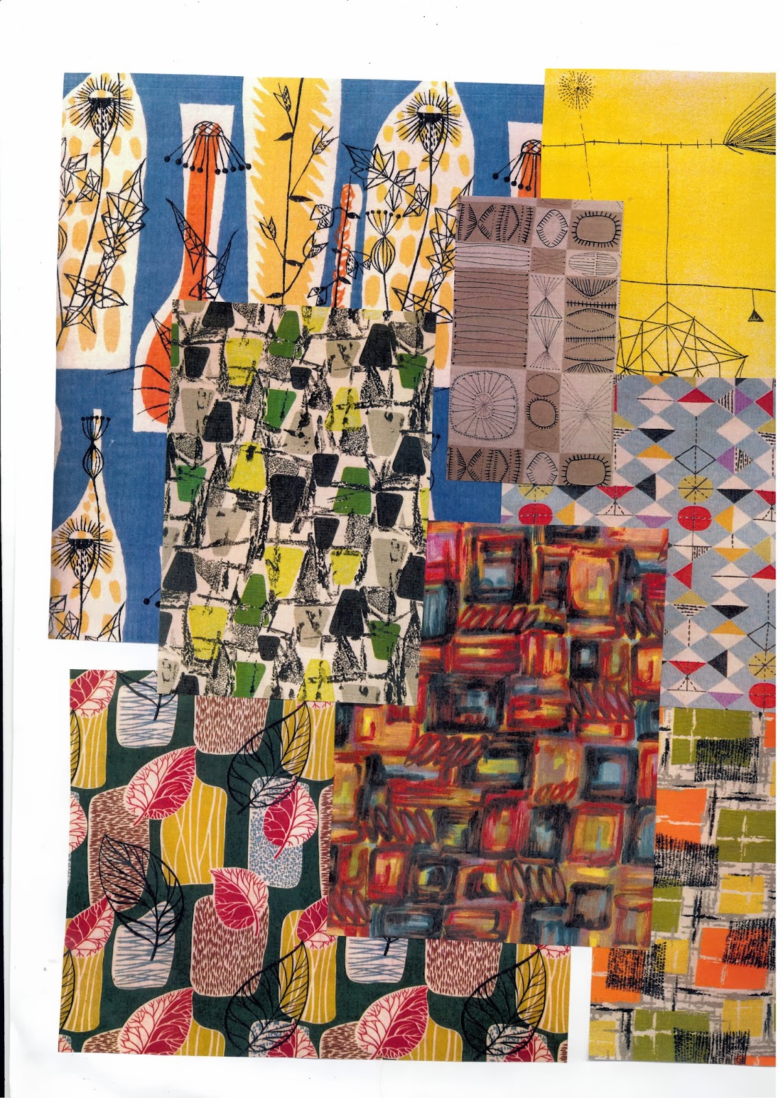
There was also some fabric sample books from the 1950s and 60s which were amazing to see as they were so different to what I had expected - often very garish bright colour ways, in unusually textured fabrics.


I really liked this print below as I thought that design-wise it was quite ambiguous, as although it was printed in the 1800s, I thought it looked very similar to some of the 50s prints I had been looking at with its geometric stylised lines and Lucienne Day style flowers. I think I would quite like to create prints that merge various time periods with fluidity, and yet still manage to look modern.


Photoshop workshops

This week I had two workshops about photoshop which tackled different areas. In Alex's photoshop 1, I learnt how to make a mask so that I can apply my images onto garments and also how to define a pattern. I feel rather rusty with photoshop at the moment, so it was useful to go over these steps (some of which I was taught in L4 during TD4F) and learn some new shortcuts. I have vaguely been thinking about putting my final prints onto t-shirts, so I went along with this idea for my test piece to see if I want to take the idea any further. I quite like the way the design spills out of the shirt to reveal more of the drawing.

Later on in the week I went to Rhianna's photoshop workshop, which was more of a general one for everyone on the course but I still found it useful to see how she created designs for her own work.


Monday, 21 October 2013

Tutorial

Today's tutorial was very useful as I feel my work has slid a bit this week, so talking to everyone else about where I can go next has really helped me get on track. I need to start thinking about motifs and eventually prints, so I think the next thing is to start drawing some symbols that I can start collaging into larger drawings. It was suggested that the whole tattoo thing has been a bit overdone, and the more I think about it, I don't want my work to fall into a cliched style, so I think I will let it stick to just being an influence rather than something directly used in my designs. 

Sunday, 20 October 2013

Drawings

I have been looking at some of Grayson Perry's work lately, and it has led me to think about including figures in my work, rather than just symbols. A lot of people said my work looks quite rockabilly and there more I draw, I feel myself going down a tattoo route, so I decided that to take a risk I should try combining something very modern such as tattoos on a 1950s women (as tattoos were a lot less a part of popular culture). I actually really like the drawing style in this one, as for the first time, my use of bold colour actually seems to be working!


Below, I decided to carry on in bold colour and bring in some of the modern day symbols. I like this as initial work, but it certainly needs refining a bit before I can start thinking about motifs for print.


Thursday, 17 October 2013

Rockabilly inspiriation

Several people have said that my work looked very 'rockabilly', so I decided I would look further into this trend. I'm not sure whether I would design my prints for this market, but I do like looking at it for inspiration.


I love these photographs by Steven Miesel for a 2007 edition of Vogue Italia, as they combine a sense of higher class and elegant beauty with the more retro rockabilly style. I also think it would be interesting to look at fake tattoo sleeves or clothing, as it is something that has often slid into more high end fashion. I think they can sometimes look quite tacky, but these leggings below by 'Wild Rose' are a slightly more understated version.


Tuesday, 15 October 2013

Bringing symbols up to date

I've been trying to work out a way of coming up with modern versions of the symbolism in the old paintings, as I don't just want to stick to the symbols we use today as that shows very little inventiveness. I came up with the idea of asking people in the studio what they thought symbolised different things today - for instance if a peach used to represent truth, what would you use to represent truth today? It was extremely interesting to hear everyone's interpretation of the question as they are varied so much! When asked what would represent 'wisdom', the various answers were 'teeth', 'wrinkles', 'owl's, and 'QI'. I'm looking forward to including these seemingly random objects into my drawings.

Artist - Eduardo Recife

It was suggested in my last tutorial that I take a look at this artist for his way of collaging images and typefaces and managing to make his work look old fashioned in a modern way. I really like how all his work doesn't stray too far from one colour palette and his interesting combination or apparently opposing objects. These are some of my favourite pieces, I particularly like the use of line in this first one as it really does look old and yet you take a closer look at the content and get a different view.


Tutorial

Was feeling a bit unhappy about my work today (perhaps because the last thing I created was the hideous peach thing) but everyone was so helpful in suggestion alterations and I now feel much more confident about my work. To fix the issue I was having about the skull drawing not fitting my periods well enough, Alex suggested I try looking at 50s adverts for a more obvious font. 

It was also suggested that I contrast my research of past symbols with modern day ones that we all unanimously understand, such as an on/off symbol. I'm looking forward to really pushing this symbolism theme; as my project moves on I feel I'm settling into 18th C and 1950s being my inspiration, and symbolism being my content.

Monday, 14 October 2013

Symbolism in paintings

I looked at a variety of paintings from a range of eras for my inspiration, mainly to compare styles and how things changed over the centuries. For an example of really early painting, there is the very well known 'Arnolfini Portrait' by Jan van Eyck. I like this painting simply from a visual sense, but there is also all the objects strewn about, from the oranges symbolising purity, the dog for loyalty, the green of the dress for hope. 


Of more interest to me however, were these 18th C still life paintings, as they are beautiful on face value, but they also have so much hidden meaning, such as the tipped over glass representing the transcience of life, or feathers meaning freedom.


Evaluation of the week

I found it really useful to create the mood boards as it very instantly gives me a visual to refer back to for inspiration on colours and pattern for each very different era. I found the sketchbook work very useful to get my ideas flowing as I was struggling with where to begin, and it helped me get a better feel for the periods. I really enjoyed looking at symbolism but I think I need to talk to more people about the modern day representations. I like the bigger contrasting pieces but I feel I need to think more about colourways as it doesn't feel quite right yet. I think I really want to do more of this illustrative work this week to really push my ideas. 

Sunday, 13 October 2013

Symbolism

After discussing that perhaps using the meaning of flowers in my work was a bit too literal, I have been thinking more about symbolism. When I actually looked into symbolism in old paintings I actually found some really interesting facts about what objects represented in paintings. I really like this, as I was interested in looking at hidden meanings at the very beginning of the project. Here are some of my notes on the subject:


I like the idea of combining two opposite symbols - here I used the skull (death) and a pair of birds (life after death) as I felt they went together quite well as a pair. I tried to combine 18th C and 50s drawing styles, but I'm not sure if that is entirely clear. I also tried to pair this peach (truth) and lemons (deception) in a thick paint 50s style, but I simply hate the result. It looks clunky, badly done and despite taking the colours straight from the mood boards, it just looks sickly. The only positive is I don't mind the composition, perhaps I can reuse that somewhere else.


Artist - William Kilburn

From all the prints I saw in the 'British Textiles' book, it was Kilburn's that were my favourite. He was an illustrator for William Curtis' Flora Londinensis around the late 1700s/early 1800s, and a leading designer of his time. I adore the detail in his prints, the delicate nature of his drawing style, his often bold use of colour and the way he brings unusual objects into his work, such as bright coral inter-twined with flowers. 


Saturday, 12 October 2013

Moodboards

The further down the line I am getting with my project, I have discovered that the two time periods I have been studying (which I previously thought were polar opposites) actually have a lot of similarities.  Whilst print content, style and shape are very different, the boldness of colour is very similar - in the late 18th century, plenty of new printing colours were being created so these started to come through in fabric designs, whilst in the 1950s the country was finally recovering after the war and bright colours began to creep back into design.

So I have decided to take a risk and continue using both periods alongside each other for inspiration, perhaps playing the two off each other. I really enjoyed going through loads of books in the library, settling on '1950s Fashion Print' by Marnie Fogg, and 'British Textiles: 1700 to the present'. I had a tonne of photocopies from both these books, but to make things visually easier I decided to make two massive inspiration boards, which I really think sums up each time period. 


1700s moodboard

1950s moodboard