Sunday 24 November 2013

Project overview

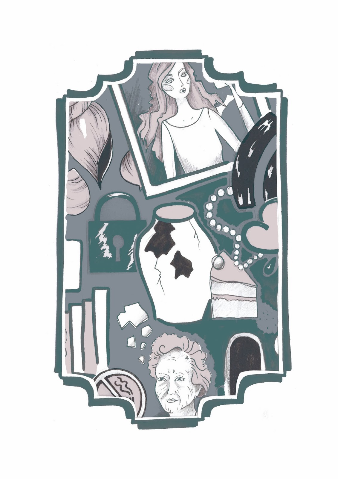
When I initially picked 'Future/Past' as my theme at the beginning of the project, I envisioned elegant gowns, studying dress shapes and eventually creating something ephemeral and pretty. What I ended up designing was the complete opposite of that, but I think it is quite exciting to see how such cliche beginnings turned into an unusual prints in bold clashing colours that still manage to harmoniously work together to create the 'Symbols in Time' collection.

I began looking at the 1700s and 1950s after my visit to Platt Hall, and at first I merely studied to see which could go where - I didn't expect to be able to combine both of them together as inspiration for my final prints - and this in itself shows risk tasking, as I took two polar opposites in design history and tried to gel them together. The big moodboards I created for each period played a pivotal role in my project as I came back to them at every step of the journey, allowing me to deeply immerse myself in the 'past' section of the brief. I enjoyed finding out so much about symbolism, and it has given me a totally different view of the world as I now stop and look at motifs and wonder what they could represent. Researching current and past artists and designers work gave me plenty of inspiration, and helped to guide me in a project where I wasn't really sure where I was going.

I have thoroughly enjoyed the challenge that was this project, and feel I really managed to settle into a work routine. Every weekly tutorial made me stop and think about my work and ended up pushing me in a different direction. It also made me realise how important the input of other students was, as without it, my work would have ended up in a totally different place.

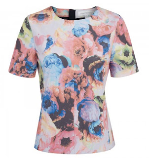
I'm really pleased with my final 12 prints, I feel they embody my project but also work in a market sense, as there is an even spread of print styles and colour ways. I'm also very proud of my final technical flats, as this is the first project where I have taken a presentation style and followed it all the way through, from inspiration boards to prints to the name card for wall presentation. I feel this makes my work appear more like a collection as there is a consistency throughout. 

Final work and presentation boards

These are the final 12 prints I selected for the 'Symbols in Time' collection. I felt 12 was a nice balanced number and I think the prints I have chosen best represent my project, the theme and also a good visual range with a mix of placement and multidirectional prints.


I decided to create these two boards to help show the process of my project in an immediately visual way, as in this particular project I didn't have a sketchbook and instead worked on separate sheets. the first is my inspiration for this project, showing the artists and designers who have influenced my work, alongside the brand I have chosen to design my work for. The second shows more of a working progress of my project, to show the journey my project has come on from mood board research, to drawings to colour stripes. I feel that shown together with my final technical flats and prints it will help to sum up my project.

Final technical drawings


These are the photoshop boards I have designed to show my final technical drawings. I trialled this style of presentation earlier on in the project and really liked how it visually ties together all the garments, so I have tried to be consistent and have applied this style to all my final boards. As I have 12 final prints in the collection, I chose to put all of them on both of my flats as I really liked seeing how different prints went together. I like the final look, and I'm pleased with my fabric selections, as I think it would make a nice contrast to have some sweaters in jersey and some slightly more like blouses in a chiffony style floaty fabric. 

Wednesday 20 November 2013

Selecting final prints


After playing around with so many techniques and therefore creating so many prints, it actually made it more hard work to select which ones to use in my final collection. To aid the decision making process, I applied all the prints to flats to see which looked best on garments (as obviously thats the most important part anyway). This somehow made it worse, as I rather liked all of them! But as my project has been quite often about public interaction (for instance, the fact that most of the symbols came from objects people suggested) so I asked people which were their favourites. Its really boosted my confidence in my work having people walk past in the studio and say 'ooh I would wear that', as for a majority of the project I was concerned that I had designed something that no-one would want to buy.


Tuesday 19 November 2013

Final tutorial

I think everyone came to the tutorial feeling rather stressed about their work, and I was personally feeling like my prints simply weren't working, but as usually everything came up roses and I left feeling infinitely better about my work! It was good to get everyone's opinion on my work and some positive feedback always helps, so now I just need to make a structured plan for the week so that it doesn't all get on top of me.

Saturday 16 November 2013

Technical flat layouts


I tried to apply my prints to these tank tops and I actually really enjoyed it. I feel like I'm finally getting to grips with photoshop (its taken a while!). I enjoyed playing around with layouts for the flats, as I feel the appropriate colours and fonts can add to the overall feel of the collection.


Friday 15 November 2013

Square repeats

I feel like I'm over-using the original drawings a bit, so I've decided to draw some fresh motifs (still from the original suggested list) to add to the pile. I've been trying out the technique Alex taught us for making multidirectional prints and I'm very pleased how they turned out.


First repeat prints


Here I put a more traditional style mask around part of my bigger print to create this shape which I hope will tessellate slightly better. I also tried to be more selective with my use of colours, which I think has worked well. I'm very pleased with how the prints turned out below, and I think the selective use of colour makes them much more wearable. 


Thursday 14 November 2013

Market research - Harvey Nichols and Selfridges

Today I went to town to have a look around some department stores for a more high end market for my product, the logic being that you would be more likely to find a large scale complex print from a slightly higher end designer. I discovered a few different designers that I thought matched the level I want to sell my work at.

MSGM

This is an Italian brand who do bold vivid colour, and random geometric prints really well. Tops (the area I am generally sticking with) were around the £200, £300 mark which I think is the part of the market I'm aiming at. 


Finders Keepers

This Australian brand combines a mix of simpler pieces with the odd bold print. Whilst I don't actually like their clothes, I can see how my prints could be pitched at a similar market level.


Clover Canyon

This LA based brand was by far the best thing I saw all day. I can see my prints fitting right into this brand, I love all their bold colourways and especially the handwriting of this prints and motifs themselves. Feel this suits my project better than Topshop ever really did. They are definitely the sort of brand I can see myself designing for in the future (plus all the prints have crazy names like 'Robot Flamingo').


Tuesday 12 November 2013

Tutorial

Got some really positive feedback about my big coloured in print, but now that Alex has seen how my prints are turning out, he suggested that Topshop as a market didn't really fit any more. So I need to go out to Harvey Nichols and find a higher end market that better suits my project - bit of a set back but I think it will benefit my project in the end. It was also suggested that I don't need to put all my colours into one print, so I think I need to tone it down slightly and instead just stick to a few colours per print. This is good though, as I feel it will rectify the issue I was having about my work not looking like textiles print.

Monday 11 November 2013

Artist - Catalina Estrada

It was suggested I look at Estrada's designs for Paul Smith, and I was immediately enthralled! Not only do I think the prints perfectly reflect what my project is about - a graphic style, original, unexpected and  using bright colours effectively - but I can also see myself in a similar position after university. I loved how she not only created prints for garments but also all of the point of sale and window dressing; I really see myself doing something that not only covers print for fashion but also other areas of design.


Saturday 9 November 2013

Initial flats

    These are my first attempts at flats, and I know I could do a much better job, so I'm just viewing them as a practice run. I wanted to see what my prints looked like on a garment but its so long since I've done one that I didn't think about drawing backs or thinking about print placement on collars. Once I've got some more prints I think I'll be able to play around a bit more.

Big drawing - colour

So now that I finally have a colour stripe, I chose to do a full colour version of my big drawing. There is so many components that I decided just to do half (which in itself took an entire afternoon). It was a complete faff to do, but I really like how it came out. My only worry is that it doesn't look anything like a textiles print and instead just looks really graphic-y....


Wednesday 6 November 2013

Colour stripes

I think it was finally time I stopped thinking about my drawings and actually started bringing more colour into my work. I wanted to use authentic colours that would evoke the two eras I have been studying, so I've decided to take my colours straight from my moodboards, as these both contain images that I have selected, so its almost like my personal selection of colour from each time period. The only problem was that obviously each one had rather too many colours for me to work with, and I needed a slightly more refined palette, so I selected all the colours from both and decided which gave me a broad representation. 
The final two swatches (I chose to keep them separate so that I can do some 18th c prints, some 50s prints and some with a mix of both colours). The thing that struck me about two periods is that they are both rather bright; I think you expect it of the 50s but not necessarily the 1700s.

Market research - Topshop

The style I've ended up working in seems to be dictating my market-place decision quite a lot. I feel the strong graphic style would fit well in the high street market, and after some research I've decided that Topshop would be a good place for my prints. Here I have picked a selection of garments that show the spread of styles sold, and although I don't think my prints are similar to these, I do think Topshop is the sort of high street shop who would sell edgy and unusual graphic prints.


Illustrator workshop

Even though I learnt how to do illustrator last year, I did find it really helpful to use this session as a chance to recap the basics. I had only ever used it for drawing technical flats, so it was interesting to find out what else I can use it for. I had never thought of using illustrator to actually draw, and I think it could be really useful for designing motifs rather than just scanning in my own drawings to colour in.


Tuesday 5 November 2013

Photoshop workshop 2

The second of Alex's workshops was extremely useful, rather complicated numbers-wise but leaving you with a wonderful final print. I really like the multidirectional style and it's so clever how quickly you can build up motifs to make something multi-layered. I can't wait to have a play around with this technique.

I also started putting colours onto my big drawing, which was rather tricky! I'm not exactly the best person at photoshop, so it took me rather a long time to work out how to do it, but I'm actually rather pleased with how it turned out. I do feel however that I need a final colour stripe, as I only picked these colours from my moodboards by eye.


Tutorial

It was great to get everyone's feedback on my drawings, as I feel I have really pushed my drawings as far as I can. Whilst everyone liked the bigger piece of artwork, I don't need to make all of my prints busy, some can be simple motifs or multi-directional prints. I feel I have definitely done enough drawing now (beginning to feel the project catching up with me and the impending deadline drawing closer) and I really need to start putting them into prints - pronto! 

Other things to think about this week are the size and shape of my garments, more solid research for my market and evidence of the fabric it would be printed on.